
Painting 101: How to Paint Open Floor Plan Effectively
Painting an open floor plan is one of the most common challenges I face as an interior designer. Without the physical boundaries of walls and doors, homeowners often feel lost, wondering where one color should stop and another should begin. It is a delicate balance of creating a cohesive flow while still defining individual “zones” for cooking, dining, and relaxing.
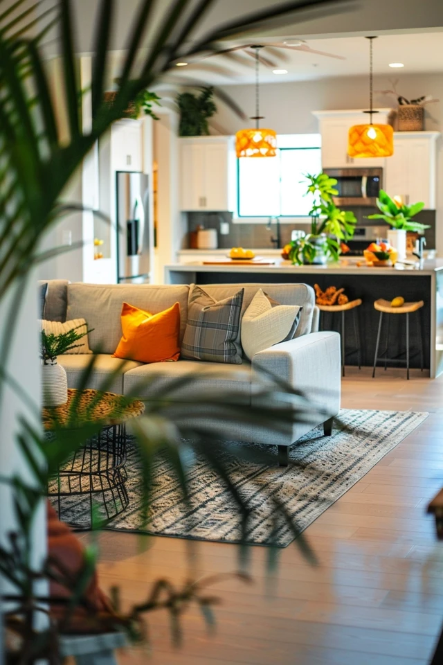
To help you visualize the transformation of these large, airy spaces, I have curated a selection of professional design examples in the Picture Gallery at the end of this blog post. By understanding the mechanics of light and the logic of architectural transitions, you can turn a cavernous room into a series of connected, intentional spaces. This guide will walk you through the professional rules of thumb for choosing palettes, managing transitions, and executing a flawless finish.
At-a-Glance: Key Takeaways
- Stick to a “Three-Color Story”: One main neutral for 60% of the space, one secondary color for 30%, and one bold accent for 10%.
- Use architectural breaks like corners, bulkheads, or trim to transition between different paint colors.
- Maintain the same trim and ceiling color throughout the entire open area to provide visual continuity.
- Pay attention to the Light Reflectance Value (LRV) of your paint to ensure the color holds up in both bright and shadowed areas.
- Consider the sheen; eggshell is the gold standard for walls, while satin or semi-gloss should be reserved for high-moisture kitchen zones.
What This Style/Idea Means (and Who It’s For)
Effective open floor plan painting is more than just picking a pretty color. It is a strategic approach to interior architecture that uses “visual cues” to replace physical walls. When we talk about painting an open space effectively, we are talking about creating a narrative that guides the eye naturally from the kitchen to the living room without any jarring interruptions.
This approach is for the homeowner who feels their house lacks “soul” or definition. If your living room feels like it is floating in a sea of beige, or if your kitchen feels disconnected from your dining area, this guide is for you. It is also highly relevant for families with children or pets, where durability must meet aesthetic appeal, and for renters who need to make a statement without making permanent structural changes.
Design-wise, this strategy fits modern, farmhouse, and transitional styles perfectly. It relies on the principle that color should serve a function. By the end of this process, you won’t just have a “painted room”; you will have a designed environment that feels larger, brighter, and more organized.
The Signature Look: Ingredients That Make It Work
To achieve a professional-grade look in an open floor plan, you need a specific set of ingredients. These elements ensure that the space feels unified rather than a patchwork of unrelated ideas. First and foremost is the “Anchor Color.” This is usually a sophisticated neutral—think warm whites, soft greys, or “greiges”—that covers the largest continuous walls.
Next is the “Transition Strategy.” In a traditional house, you stop painting at the door frame. In an open plan, you must look for “natural breaks.” These are inside corners where two walls meet at a 90-degree angle. Never stop a color on an outside corner or in the middle of a flat wall; it creates a visual “cliff” that looks unfinished.
Lighting is another critical ingredient. Open floor plans often have windows on multiple sides. A color that looks like a soft cream in the south-facing kitchen might look like a cold grey in the north-facing living area. You must test your colors in “large-scale” swatches—at least 2 feet by 2 feet—on different walls to see how the pigment reacts to shifting light throughout the day.
Finally, the “Trim Thread” is what ties it all together. No matter how many colors you use on the walls, keep the baseboards, crown molding, and window casings the same color. A crisp, consistent white or a deep, moody charcoal used across all trim creates a “frame” that holds the different zones together.
Layout & Proportions (Designer Rules of Thumb)
When I start a project, I look at the floor plan and identify the “Primary Sightline.” This is the view you see the moment you walk through the front door or enter from the main hallway. Your most important color—your Anchor—should be prominent along this sightline to create a sense of calm and order.
The “60-30-10 Rule” is your best friend here. In an open plan, 60% of the visible wall space should be your primary neutral. 30% can be a secondary color, often used in a specific zone like the dining nook or the kitchen area. The remaining 10% is for accents—this could be a fireplace wall, the back of a bookshelf, or an kitchen island. This ratio prevents the space from feeling cluttered or overwhelming.
Measurement is also key. If you are painting an accent wall, the wall should be at least 8 feet wide to justify the color change. Anything smaller can look like a mistake. If you have vaulted ceilings, consider the “Two-Thirds Rule.” If a wall is exceptionally high (over 12 feet), you can use a darker color on the bottom two-thirds and a lighter color on top to bring the “human scale” back to the room, though this requires a chair rail or a clean tape line.
Designer’s Note: One of the most common mistakes I see is people changing colors at an outside corner (the corner that points into the room). This almost always results in a messy line that catches the light and highlights every imperfection. Always transition at an inside corner where the shadow naturally hides the seam between two colors.
Step-by-Step: How to Recreate This Look
1. Map Your Zones: Before you even open a paint can, use blue painter’s tape to mark where your furniture will go. This helps you see where the “living room” ends and the “dining room” begins. Identify the inside corners that will serve as your transition points.
2. Select Your Palette: Choose three colors from the same “strip” on a paint fan or choose colors with the same undertone (all warm or all cool). This ensures they will harmonize. Purchase samples and paint them directly on the walls in various zones.
3. Prep the Surface: Large open walls reveal every bump and crack. Patch holes with spackle, sand them flat, and use a high-quality primer. In open plans, the light hits the walls at a low angle from distant windows, which makes “flashing” (uneven sheen) very obvious if you don’t prime correctly.
4. Paint the Ceiling and Trim First: It is much easier to “cut in” the wall color against a finished ceiling than the other way around. Use a flat finish for the ceiling to hide imperfections and a semi-gloss for the trim for durability and easy cleaning.
5. Establish the Anchor: Paint the largest, most visible walls in your primary neutral. Use a 9-inch or 12-inch roller with a 3/8-inch nap for a smooth finish. Work in 4-foot sections, maintaining a “wet edge” to avoid visible lap marks on those long, continuous walls.
6. Define the Zones: Apply your secondary and accent colors to the pre-identified zones. If you are painting a kitchen area within the open plan, ensure you use a “Satin” finish here, as it resists the steam and grease common in cooking spaces.
7. The Final Edit: Step back and look at the transitions. If a color change feels too abrupt, consider adding a piece of furniture, a large plant, or a floor-to-ceiling curtain at the transition point to soften the visual break.
Budget Breakdown: Low / Mid / Splurge
Low Budget (The DIY Warrior): $300 – $600
This budget covers the cost of high-quality paint (approx. 4-6 gallons for a standard open plan) and basic tools. You are doing all the labor yourself. Focus on one main color for 90% of the space and use a single “pop” of color for an accent wall. Spend your money on high-quality brushes and rollers, as cheap tools will leave streaks on large walls.
Mid Budget (The Strategic Refresh): $1,500 – $3,500
At this level, you might hire a professional to handle the “cutting in” and the high ceilings, or you might invest in premium designer paint with higher pigment loads. This budget allows for a more complex three-color palette and perhaps the addition of decorative moldings or “picture frame” trim to create natural stopping points for your paint colors.
Splurge (The Full Designer Transformation): $5,000 – $10,000+
This involves hiring a full professional crew to prep, prime, and paint multiple tones. It often includes specialized finishes like lime wash or Roman clay on a focal point wall. This budget also covers painting the kitchen cabinetry to match or complement the new wall colors, creating a truly seamless, “magazine-ready” environment.
Common Mistakes (and How to Fix Them)
The “Choppy” Effect: This happens when you use too many colors in one open space. It makes the room feel smaller and cluttered.
The Fix: Re-paint one or two of the zones in your primary anchor neutral. Reduce your palette to no more than three harmonious tones.
Ignoring the “Fifth Wall”: Many people leave their ceiling a stark, “off-the-shelf” white while painting the walls a warm beige. This creates a harsh line that makes the ceiling feel lower.
The Fix: Paint the ceiling in a “diluted” version of your wall color (25% strength) or a warm white that matches the undertone of your walls.
Sheen Mismatch: Using a “Flat” finish in a high-traffic area like a kitchen entryway results in scuffs that can’t be cleaned.
The Fix: Apply a clear “Dead Flat” varnish over the flat paint to add protection, or simply repaint that specific section in an “Eggshell” or “Satin” finish for better wipeability.
The Wrong Undertone: Choosing a “cool” grey for the living room and a “warm” cream for the kitchen can make the transition look muddy.
The Fix: Ensure all colors share a common base. If you go warm, keep all colors on the yellow/red side of the spectrum. If you go cool, stick to blue/green undertones.
Room-by-Room Variations
Even in an open plan, different “areas” have different needs. In the Kitchen Zone, functionality is king. I recommend using a color that complements your cabinetry. If you have white cabinets, a soft sage green or a navy blue on the surrounding walls can create a beautiful “furniture-look” for your kitchen. Ensure the paint is scrubbable.
The Living Zone should focus on comfort and light. This is the best place for your Anchor Color. If you have a fireplace, this is your opportunity for an accent color. Painting the fireplace mantel or the chimney breast two shades darker than the surrounding walls adds depth without breaking the flow.
In the Dining Zone, you can afford to be a bit more dramatic. Since this area is often used more in the evening, a deeper, moodier color can create an intimate atmosphere. If the dining area is tucked into a nook, painting the entire nook—including the ceiling—a single cohesive color can make it feel like a high-end restaurant booth.
The Entryway serves as the “handshake” of the home. This area should use the Anchor Color but can benefit from a higher sheen or a durable wall treatment like wainscoting painted in the trim color. This handles the wear and tear of bags, coats, and shoes while leading the eye into the main open space.
Finish & Styling Checklist
Once the painting is finished, the job isn’t quite done. Use this checklist to ensure the space is cohesive:
- Check all “cut-in” lines at the ceiling and baseboards. Are they crisp? If not, use a tiny artist’s brush for touch-ups.
- Ensure all switch plates and outlet covers match the wall color or the trim. Plastic white covers on a dark navy wall are a major design “no-no.”
- Evaluate your rug placement. Rugs should act as the “islands” for your furniture and should help reinforce the color zones you created with paint.
- Update your lighting. If you painted the walls a warmer tone, ensure your light bulbs are in the 2700K to 3000K range. If you went with cool tones, 3500K to 4000K works better.
- Coordinate your textiles. Throw pillows, blankets, and curtains should pull colors from your 60-30-10 palette to tie the whole room together.
FAQs
Can I use an accent wall in an open floor plan?
Yes, but be selective. An accent wall works best when it highlights an architectural feature, like a fireplace or a large window bank. Avoid putting an accent wall on a plain flat wall that has no natural beginning or end, as it will look like a floating block of color.
What is the best paint finish for a large, sunny room?
Eggshell is almost always the best choice. It has a slight sheen that allows for cleaning but is matte enough to absorb light rather than reflecting it. High-gloss or even Satin can create a “glare” on large walls that is very distracting in bright sunlight.
How do I choose a white that doesn’t look like a hospital?
Look at the undertones. Avoid “True White.” Instead, look for “Warm Whites” with a hint of yellow, pink, or peach. These will react with the natural light to feel cozy and lived-in rather than sterile and cold.
Do I have to paint the whole space at once?
Ideally, yes. Because open plans have continuous walls, painting one section now and another section six months later can result in a visible “seam” where the paint batches don’t perfectly match due to fading or different dye lots.
Conclusion
Painting an open floor plan effectively is about mastering the art of the “invisible boundary.” It requires you to look at your home not as a collection of separate rooms, but as a single, flowing landscape. By choosing a cohesive palette, respecting architectural transitions, and paying close attention to the way light moves through your space, you can create a home that feels both expansive and intimate.
Remember that paint is the most cost-effective tool in your design arsenal. It has the power to define space, evoke emotion, and provide a polished backdrop for your life. Take your time with the preparation, trust the rules of proportion, and don’t be afraid to use color to tell a story. Now that you have the technical knowledge, you are ready to transform your open-concept living space into a balanced and beautiful environment.
Picture Gallery
Picture Gallery


