
Pantry Wallpaper Ideas to Inspire Your Space
Introduction
The pantry is often the unsung workhorse of the home. We treat it purely as storage, cramming cereal boxes and canned goods onto utilitarian shelves behind a closed door. But as an interior designer, I see the pantry as a hidden “jewel box”—a small, contained space where you can take massive design risks with very little consequence.
Because pantries are usually separated from the main kitchen flow, you do not need to worry as much about perfectly matching your living room upholstery or your dining room rug. This is the perfect zone to experiment with whimsical patterns, moody dark tones, or vibrant colors that you might be too scared to use in a larger room. It is a space that should bring you joy every time you open the door to grab a snack.
If you are looking for visual examples to spark your creativity, keep reading because I have curated a stunning Picture Gallery at the end of this blog post.
Understanding Scale and Visual Weight in Small Spaces
One of the most common questions I get from clients is about the scale of a pattern in a small room. There is a persistent myth that small rooms require small patterns. In my experience, the opposite is often true. Small, ditsy prints can actually make a cramped pantry feel cluttered and busy, especially when combined with the visual noise of food packaging.
I often recommend medium-to-large scale patterns for pantries. A large floral or a broad geometric shape helps expand the visual boundaries of the room. When you walk into a pantry, you are usually viewing the walls from a distance of less than three feet. A larger print gives the eye a place to rest rather than bouncing around thousands of tiny dots.
However, you must respect the architecture. If your pantry is a shallow reach-in closet (24 inches deep), avoid murals that require a 10-foot viewing distance to understand the image. Stick to “repeat patterns” where the motif repeats every 12 to 24 inches. This ensures that even if a shelf blocks part of the design, the brain can still fill in the rest of the pattern logic.
Designer’s Note: The “Cut-Off” Rule
In a recent project, a client fell in love with a large-scale bird motif wallpaper. It was stunning, but we realized too late that the fixed shelving heights would cut the heads off almost every bird in the design.
Before ordering, measure your shelf spacing. If your shelves are spaced 14 inches apart (a standard height for cereal boxes), make sure the key elements of your wallpaper pattern are smaller than 12 inches or positioned in a way that they won’t be decapitated by a shelf bracket.
Choosing the Right Material: Durability Matters
Kitchens are high-traffic zones, and pantries are no exception. While we don’t have the same grease concerns as a backsplash behind a stove, pantries deal with crumbs, spills, and constant friction from moving boxes and appliances. The material you choose is just as important as the pattern.
I generally advise against standard cellulose paper for pantries unless it has a protective coating. It stains easily and absorbs oil. Instead, look for “non-woven” papers or vinyl-coated papers. Non-woven wallpapers are a blend of natural and synthetic fibers. They are breathable, which prevents mold (important in unventilated closets), and they are tear-resistant.
For the highest durability, Type II Vinyl is the gold standard. This is what we use in commercial spaces. It is scrubbable, meaning you can take a damp sponge and mild soap to it without rubbing the ink off. If you store small appliances like mixers or blenders in your pantry, vinyl is essential because pulling those cords against the wall will eventually scuff a delicate paper.
A Note on Peel-and-Stick
Peel-and-stick wallpaper is a fantastic option for renters or those who like to change their mind often. However, apply it with caution in a pantry that houses a freezer or wine fridge. These appliances generate heat.
Fluctuating temperatures can sometimes cause the adhesive on lower-quality peel-and-stick papers to fail or bubble. If your pantry runs warm, use a traditional paste-the-wall wallpaper for a permanent bond.
Color Theory and Lighting Constraints
Most pantries suffer from a lack of natural light. Unless you are lucky enough to have a butler’s pantry with a window, you are likely relying on overhead recessed lighting or under-shelf LED strips. This lighting reality should dictate your color choice.
Dark wallpapers (navy, charcoal, forest green) can look incredibly chic and high-end. They create a “boutique” feel. However, dark walls absorb light. If you choose a dark paper, you must upgrade your lighting. I recommend 3000K to 4000K LED bulbs. Anything warmer (2700K) will make a dark pantry feel muddy and cave-like.
On the other hand, white-background wallpapers reflect light and make the space feel crisp and clean. If your pantry is essentially a dark closet, a white ground with a colorful pattern is the safest bet to keep it looking bright.
Coordinating with Cabinetry
If your pantry has cabinetry, the wallpaper needs to bridge the gap between the cabinet color and the hardware.
- Cool Tones: If you have gray or blue cabinets, look for wallpapers with cool undertones (silver, crisp white, blues).
- Warm Tones: If you have wood grain or cream cabinets, stick to warm undertones (gold, beige, off-white).
- Hardware Matching: If your wallpaper has metallic gold accents, ensure your shelf brackets or cabinet pulls are also brass or gold. Mixing metals can work, but in a tiny space like a pantry, matching them feels more cohesive.
Styling Your Shelves to Complement the Paper
The wallpaper is only half the battle; how you style the shelves in front of it determines the final look. The biggest mistake people make is choosing a loud wallpaper and then filling the shelves with branded packaging (Cheerios boxes, soup cans, chip bags). The result is visual chaos.
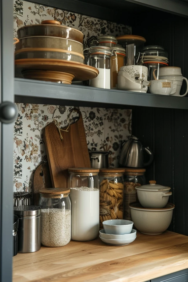
To make patterned wallpaper work in a pantry, you need to practice “decanting.” This means taking food out of its original packaging and putting it into clear glass or plastic containers. Clear containers allow the wallpaper to show through the gaps.
If you cannot decant everything, use baskets. Woven hyacinth or wire baskets can hold the “ugly” stuff (bags of chips, protein bars) while adding texture. Place these opaque baskets on the lower shelves. Keep the upper shelves—which are at eye level—reserved for clear jars and pretty items so the wallpaper gets its moment to shine.
The 60/40 Rule
For open shelving against wallpaper, I use the 60/40 rule. Fill the shelves about 60% of the way. Leave 40% of the visual space open (gaps between jars, space above stacks of plates). This negative space is necessary to actually see the pattern you paid for. If you pack the shelves 100%, you might as well have just painted the wall.
Wallpaper Placement: Beyond the Four Walls
You do not always have to wallpaper all four walls. In fact, in a walk-in pantry, doing so can sometimes feel claustrophobic. Here are three alternative placements I use in real projects to save money and add interest.
1. The “Hutch” Look
If you have a countertop in your pantry with upper cabinets or open shelves above it, just wallpaper the backsplash area between the counter and the first shelf. This mimics the look of a high-end furniture hutch. It requires very little material—often just one roll—making it a budget-friendly way to use a very expensive designer paper.
2. The Fifth Wall
Wallpapering the ceiling is a trend that is here to stay. In a small pantry, drawing the eye upward makes the ceiling feel higher. Paint the walls a solid color that matches a tone in the paper, and put the pattern on the ceiling. This is unexpected and delightful.
3. Back of Shelves
If you are renting or just hesitant about pasting walls, cut foam core boards to the size of the back of your bookshelves. Apply wallpaper to the foam core and push them to the back of the shelves. It gives the look of a wallpapered niche without any permanent installation.
Common Mistakes + How to Fix Them
Mistake: Ignoring the Return Walls
In a reach-in pantry, people often wallpaper the back wall but leave the side walls (the returns) white. This breaks the immersion.
Fix: Wallpaper the side walls as well, or paint them a color that matches the darkest tone in the wallpaper. Do not leave them builder-grade white.
Mistake: Bad Seams Behind Shelves
Installers sometimes get lazy behind shelves, assuming the jars will hide the seams.
Fix: Always verify your installer knows that shelves will be loaded with clear items. The pattern match needs to be perfect from top to bottom, not just at eye level.
Mistake: Buying Too Little Paper
Pantries have a lot of cutting involved because of brackets, outlets, and tight corners.
Fix: Standard overage for wallpaper is 15%. For a pantry with many obstacles, I recommend purchasing 20% extra. You need that extra wiggle room for pattern matching around tight corners.
What I’d Do: A Real Project Mini-Checklist
If I were designing your pantry tomorrow, this is the exact workflow I would follow:
- Step 1: Audit the items. I would look at what you actually store. Is it ugly packaging or pretty jars? This decides how “busy” the wallpaper can be.
- Step 2: Check the walls. Are they smooth? If the walls are textured (orange peel), I would specify a wallpaper with a slight texture or heavy weight to hide the bumps.
- Step 3: Lighting check. I would swap your bulbs to 3500K or 4000K before selecting a color sample to see the true hue.
- Step 4: Select the paper. I would choose a non-woven paper for breathability and ease of installation.
- Step 5: Paint the trim. I would paint the baseboards and door casing in a color pulled from the wallpaper, rather than white. This makes the room feel custom-designed.
Final Checklist
Before you click “buy” on those rolls, ensure you have covered these bases:
- Measure twice: Measure width and height of every wall. Don’t subtract for doors; act as if they are solid walls to ensure you have enough pattern match.
- Check the dye lot: Ensure all rolls come from the same batch number (dye lot) so the colors match perfectly.
- Sample first: Order a physical sample. Tape it to the wall and look at it with the pantry door closed and the light on.
- Durability check: Scratch the sample with your fingernail. If the ink flakes off, it won’t survive the pantry.
- Adhesive check: Confirm if you need paste, or if it is pre-pasted or peel-and-stick. Buy the correct primer for that specific paper type.
FAQs
Can I wallpaper wire shelving?
Technically yes, but it is visually messy. The vertical lines of the wire rack fight with the wallpaper pattern. If you have wire shelving, I highly recommend replacing it with solid wood or melamine shelves before wallpapering. It upgrades the look instantly.
How do I clean wallpaper in a pantry?
For vinyl or coated papers, use warm water and a tiny drop of dish soap on a non-abrasive sponge. Squeeze the sponge out well; you want it damp, not wet. Wipe gently. Never use bleach or magic erasers, as they can remove the ink or sheen.
Is it expensive to wallpaper a pantry?
It is one of the cheapest rooms to do because the square footage is low. An average walk-in pantry might need 3 to 5 rolls. If you hire a pro, expect to pay between $300 and $800 for installation, depending on your location and the complexity of the corners.
What if I have textured walls?
Peel-and-stick wallpaper hates textured walls. It will fall off. If you have texture, you have two options: skim coat the walls flat (messy and expensive) or use a traditional “paste-the-wall” thick paper. There are also specific “liner papers” you can hang horizontally first to create a smooth surface for the decorative paper.
Conclusion
Your pantry does not have to be a dark, chaotic closet that you hide from guests. By treating it with the same design attention as a powder room or foyer, you turn a mundane daily task—grabbing ingredients for dinner—into a moment of visual delight.
Whether you choose a bold citrus print to reflect the food stored within, or a moody geometric pattern to create depth, the key is balancing the scale with your storage needs. Remember to prioritize durability, plan your lighting, and always buy a little more paper than you think you need.
Picture Gallery


