
Party Color Decor – Ideas to Make Your Bash Pop!
Introduction
Designing an event is very similar to designing a permanent living space, only with more freedom to break the rules. When I step into a client’s home to help style a party, the biggest challenge isn’t usually a lack of ideas, but a lack of cohesion. People often grab every colorful item from the party store, resulting in visual clutter rather than a curated experience.
My goal is to help you treat your party decor like a temporary interior design project. We will focus on flow, lighting, and scale just as much as we focus on the color palette itself. For a dose of inspiration before you start planning, check out the comprehensive Picture Gallery at the end of this blog post.
By the end of this guide, you will know how to manipulate space using color and light. We will cover everything from the architectural placement of balloons to the exact Kelvin temperature needed for your bulbs. Let’s turn your home into a sophisticated venue that feels intentional and vibrant.
1. Establishing Your Palette: The 60-30-10 Rule
In interior design, we live by the 60-30-10 rule to ensure balance. This rule is absolute gold when applied to party decor. It prevents the space from looking chaotic and gives the eye a place to rest.
The 60% (The Dominant Color)
This is the background color that unifies the space. For a party, this usually includes your table linens, larger furniture pieces, or the existing wall color of your room. If your living room is painted a soft gray, you don’t need to fight it; let that be your canvas or drape large fabrics to change it.
The 30% (The Secondary Color)
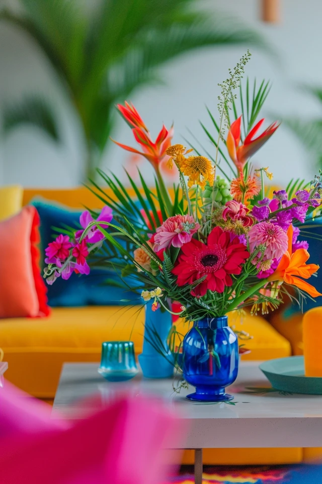
This color provides visual interest and supports the dominant tone. Use this color for significant decor elements like balloon garlands, floral arrangements, or seat cushions. This should be distinct enough to pop against the 60% but not so loud that it takes over.
The 10% (The Accent Color)
This is the “jewelry” of the party. Use your boldest, brightest shade here. Think napkins, cocktail straws, candle votives, or ribbons on favors. Because it is used sparingly, you can afford to use high-impact metallics or neons here without overwhelming guests.
Designer’s Note: Picking the Right Scheme
- Monochromatic: Variations of one hue (e.g., Navy, Sky Blue, Baby Blue). This creates a sophisticated, architectural look.
- Analogous: Colors next to each other on the wheel (e.g., Red, Orange, Yellow). This feels harmonious and natural, great for daytime events.
- Complementary: Opposites on the wheel (e.g., Blue and Orange). This is high-energy and best for evening bashes or kids’ parties.
2. Manipulating Atmosphere with Colored Lighting
Paint is permanent, but light is temporary. As a designer, I believe lighting is the single most cost-effective way to completely transform the color of a room for a single night. You can wash a white wall in deep purple without lifting a paintbrush.
Smart Bulbs and RGB Strips
Swap out your standard floor lamp and table lamp bulbs for smart RGB bulbs. You can control the exact hue and intensity from your phone.
Pro-Tip: Keep the lights dimmed to about 20-30% intensity. High-intensity colored light can feel like an interrogation room; low light feels like a lounge.
Uplighting for Drama
Place LED uplights (often battery-operated) at the base of plants, curtains, or architectural corners. Aim them upward to create pillars of color. This draws the eye up, making ceilings feel higher and the room feel grander.
The Importance of Warmth
If you aren’t using “party colors” for light, pay attention to color temperature. For a cozy, intimate gathering, ensure your bulbs are 2700K (Warm White). Avoid 5000K (Daylight) bulbs for evening parties, as they can make guests look washed out and the atmosphere feel sterile.
Common Mistakes + Fixes
Mistake: Relying on the overhead “big light.”
Fix: Turn off all overhead recessed lighting. Rely entirely on eye-level sources (lamps) and floor-level sources (uplights) to create flattering shadows and depth.
3. Textiles and Tablescapes: Zoning with Color
In open-concept homes, parties can feel formless. Guests often clutter in the kitchen while the living room stays empty. You can use color blocking to define specific zones and encourage movement through the space.
The “Hot” Zone (Food and Drink)
Use warm, energetic colors like reds, oranges, or golds near the bar and buffet. These colors stimulate appetite and conversation.
The “Cool” Zone (Lounge and Seating)
Use cooler tones like blues, greens, or violets in seating areas. These colors lower the heart rate and encourage guests to sit and relax. If you have a neutral sofa, use rental pillows or throw blankets in these shades to signal “this is a chill zone.”
Rug Layering
Don’t be afraid to put a rug on top of a rug. If you have a neutral jute rug but want a disco theme, layer a smaller, colorful, or patterned rug on top near the seating area. It anchors the furniture and adds an immediate splash of color to the floor plane.
Real-World Constraint: Renters
If you are renting and cannot change the beige walls:
- Use removable wallpaper on just one feature wall as a photobooth backdrop.
- Hang fabric from the ceiling using command hooks (check weight limits, usually 0.5 lbs for small hooks) to create a colorful canopy tent effect.
- Focus on “up-down” decor: colorful rugs on the floor and suspended decor from the ceiling, leaving the walls neutral.
4. Scaling Up: Decor Volume and Placement
A common error I see is “polka-dotting” the room with small decor items. One streamer here, one balloon there. In design, we use the principle of massing. Grouping items together creates a focal point, whereas spreading them out creates clutter.
The Rule of Three
When arranging colorful vases, candles, or centerpieces, always group in odd numbers (3, 5, or 7). The human eye finds odd numbers more natural and engaging than even pairs. Vary the heights within the cluster to keep the eye moving.
Balloon Architecture
Avoid standard helium bunches on strings. Instead, build organic balloon garlands that crawl up architectural features like stair banisters, fireplace mantels, or door frames.
Scale Tip: Mix balloon sizes. You need 24-inch balloons mixed with 11-inch and 5-inch balloons. The variety in scale makes it look like an art installation rather than a birthday party pack.
Vertical Integration
Don’t let all the color sit at waist height (tables). You need color at eye level and above.
Table Height: Centerpieces should either be low (under 12 inches) or very tall and thin (over 24 inches) so they don’t block conversation across the table.
5. Outdoor Integration: Extending the Palette
If your party spills outdoors, the color story must continue. This makes the home feel twice as big. However, outdoor color needs to compete with natural green foliage and varying light conditions.
Durability and Weight
Outdoor decor must withstand wind. Avoid lightweight paper decor unless it is securely tied down. Use weighted, colorful ceramic pots or heavy melamine tableware.
High-Contrast Choices
Dark colors often disappear at night outside. Opt for whites, pastels, or bright neons that will reflect ambient light. If you want a dark moody vibe, you must pair it with significant task lighting.
Transition Spaces
Treat the threshold (doorway) as a mixing zone. If the inside is Blue and the outside is Green, place a rug or arrangement at the door that contains both Blue and Green. This signals to the guest that the party continues outward.
What I’d Do in a Real Project: Outdoor Checklist
- Lighting: String bistro lights in a “V” or “W” pattern overhead for structure.
- Linens: Use clips or weights for tablecloths immediately. Don’t wait for the wind to start.
- Comfort: Have a basket of rolled blankets in the party’s accent color for chilly evenings.
Final Checklist: The Designer’s “Day-Of” Walkthrough
Before the first guest arrives, I always do a final sensory walkthrough. Walk through your front door and move through the house as a guest would.
1. Entryway Impact: Is there a pop of color immediately upon entering? (e.g., a wreath, a rug, a sign).
2. Sightlines: Stand in the kitchen. Can you see the decor in the living room? Ensure colors draw you from one room to the next.
3. Trip Hazards: Are the floor lamps with the colored bulbs taping down their cords? Use gaffer tape (it doesn’t leave residue).
4. Lighting Levels: Dim the lights. Check for dark corners that feel “dead.” Add a candle or uplight there.
5. Table Check: Sit at the dining table. Can you see over the centerpiece?
6. Bathroom: Did you remember the powder room? Add colorful hand towels and a small floral arrangement.
7. Scent: Does the scent match the color? (e.g., Citrus scent for yellow/orange decor, pine/wood for green).
8. Temperature: If you have many people, lower the thermostat by 3-5 degrees before the party starts.
9. Music: Start the playlist. Atmosphere is audio-visual.
10. Trash Flow: Have visible trash and recycling bins, perhaps labeled with signs in your party colors.
Common Mistakes + Fixes
Mistake: Using too many competing patterns.
Fix: If your tablecloth is patterned, keep the plates and napkins solid. If your plates are patterned, use a solid tablecloth. Visual breathing room is essential.
Mistake: Ignoring the “ugly” stuff.
Fix: Don’t leave the bright blue recycling bin out if your party theme is red and gold. Drape utility items in fabric or move them to a garage/closet. Even water coolers can be wrapped.
Mistake: Buying items that only work for one night.
Fix: Invest in high-quality neutral linens (white, gray, linen) and use cheap, disposable items for the colorful accents. You can use white napkins for 10 years; you will only use “Over the Hill” napkins once.
FAQs
How do I mix metallics without it looking tacky?
The rule of thumb is to pick one dominant metal and one accent. For example, Silver (dominant) with hints of Gold looks chic. Mixing Gold, Silver, Rose Gold, and Copper equally often looks messy. Texture matters too; mix brushed metals with polished ones for depth.
I have a small apartment. How do I add color without clutter?
Focus on the walls and ceiling. Use a projector to cast colorful abstract shapes or movies on a blank wall. It takes up zero floor space but colors the entire room. Also, focus on consumables: colorful cocktails and food serve as decor that disappears as the night goes on.
Can I mix warm and cool colors?
Absolutely, but you need a “bridge” color. If you want Blue (cool) and Orange (warm), ensure you include plenty of White or Cream to separate them, or use a pattern that contains both to unify the look.
Conclusion
Decorating for a party is the perfect sandbox for testing bold interior design ideas you might be scared to try permanently. It allows you to play with scale, lighting, and color theory in a low-stakes environment. Remember that the goal is connection; your decor should facilitate flow and conversation, not distract from it.
Focus on the 60-30-10 rule, control your lighting temperature, and ensure your layout makes physical sense. By treating your party like a mini-renovation, you create an immersive experience that guests will remember long after the balloons have deflated.
Picture Gallery


