
Perfect Wall Colors for Gray Kitchen Cabinets
Gray kitchen cabinets have effectively replaced white as the modern neutral of choice for many homeowners. They offer a sophisticated balance between the crispness of white and the drama of black, but choosing the right wall color to complement them is often harder than it looks. Gray is never just gray; it is a chameleon that changes based on lighting, surrounding elements, and its own hidden undertones.
In this guide, I will walk you through the exact process I use with my design clients to select the perfect wall color for gray cabinetry. We will look at how to identify undertones, how to manage lighting conditions, and which specific paint colors create the most harmonious palettes. For plenty of visual inspiration to help you visualize these combinations, be sure to check out the Picture Gallery at the end of this blog post.
Whether you are renovating a rental or building your dream home, the right wall color can make your gray cabinets sing. Let’s dive into the details so you can paint with confidence.
Understanding the Undertones of Your Gray Cabinets
Before you even look at wall paint swatches, you must identify the “temperature” of your cabinets. In my years of designing kitchens, the biggest mistake I see is mixing warm grays with cool wall colors, or vice versa. This often results in a room that feels “off” or muddy without the homeowner knowing why.
Gray cabinetry generally falls into three categories: blue-gray (cool), green-gray (neutral/warm), and violet or taupe-gray (warm).
To find your undertone, tape a piece of bright white printer paper against your cabinet door. If the gray looks steely or crisp, it likely has blue undertones. If it looks muddy or mushroom-like, it leans toward taupe or violet. If it feels earthy like stone, it probably has green or brown undertones.
Once you know your cabinet’s personality, you can choose a wall color. Your goal is either to harmonize with that undertone (creating a monochromatic look) or contrast against it (creating a dynamic look). Ignoring this step is usually why paint colors look great in the store but terrible in your kitchen.
Option 1: Crisp Whites for a Modern, Clean Look
Pairing gray cabinets with white walls is a timeless choice that rarely fails, provided you pick the right white. This combination creates a high-contrast, airy feel that works exceptionally well in smaller kitchens or spaces with limited natural light.
The key here is contrast. If your cabinets are a very light gray, you need a stark, bright white to ensure the cabinets don’t just look like dirty white. If your cabinets are charcoal, a softer, creamy white can prevent the room from feeling too sterile or clinical.
Top Picks for Cool Gray Cabinets:
- Benjamin Moore Chantilly Lace: This is my go-to “true white.” It has very little undertone, making it perfect for cool, blue-based gray cabinets. It keeps the space feeling crisp and architectural.
- Sherwin Williams Extra White: A cool, bright white that reflects light beautifully. It has a slight blue cast that pairs effortlessly with slate or steel-colored cabinetry.
Top Picks for Warm/Greige Cabinets:
- Benjamin Moore White Dove: This is a universal favorite for a reason. It is soft and creamy without looking yellow. It bridges the gap perfectly for greige or taupe-based cabinets.
- Sherwin Williams Alabaster: If your gray cabinets lean toward mushroom or putty, Alabaster provides a warm, inviting backdrop that makes the kitchen feel cozy rather than cold.
Option 2: Navy and Charcoal for Drama and Depth
If you want a high-impact, designer look, stop treating the walls as a background and make them a feature. Dark walls paired with gray cabinets create a moody, sophisticated atmosphere. This works particularly well in kitchens with high ceilings or an abundance of natural light.
When going dark, I recommend using a matte or eggshell finish on the walls to absorb light, which makes the color feel velvety and rich. If you have light countertops (like marble or white quartz), dark walls will make those surfaces pop incredibly well.
Designing with Navy:
Deep navy blue is a natural partner for gray because gray is essentially a desaturated blue in many cases. A deep navy wall with light gray cabinets feels nautical and classic. Ensure your hardware is significant—brass or polished nickel looks stunning against this dark backdrop.
Designing with Charcoal or Black:
Monochromatic schemes are trending for a reason. Pairing mid-tone gray cabinets with charcoal walls creates a seamless, wrapped effect. To make this work, ensure there is at least a 20% difference in Light Reflectance Value (LRV) between the cabinets and the walls so they don’t blend into a single blob.
Option 3: Earthy Greiges and Off-Whites
Sometimes you want warmth without yellow. This is where “greige” (gray + beige) shines. This is often the hardest category to get right, but when done correctly, it looks the most expensive and custom.
The goal is to create a layered look. If your cabinets are a cool gray, a warmer greige wall warms up the space so it doesn’t feel like a hospital. If your cabinets are already warm, a lighter greige wall creates a soft, tone-on-tone effect that is very soothing to the eye.
Texture Matters:
With this color palette, texture is your best friend. Since the contrast is low, you need other elements to create interest. I always suggest incorporating wood elements—like open shelving, a butcher block island, or hardwood floors—to break up the expanses of neutral paint.
My Favorite Greige Paints:
- Sherwin Williams Accessible Beige: This color has just enough gray to prevent it from looking like a builder-grade beige. It works wonders with medium-tone gray cabinets.
- Benjamin Moore Edgecomb Gray: A light, airy greige that reads as a sophisticated organic neutral. It is perfect for open-concept homes where the kitchen walls flow into the living room.
Option 4: Soft Greens and Blues
Bringing in colors from nature is a fantastic way to soften the industrial feel of gray cabinets. Soft sage greens and dusty blues are “near-neutrals” that add personality without overwhelming the space.
The Sage Green Approach:
Green and gray are neighbors on the color wheel of nature. Think of stones and moss. A soft, silvery sage green wall looks incredible with charcoal or mid-tone gray cabinets. It brings a sense of calm and organic freshness to the kitchen. This combination works exceptionally well with oil-rubbed bronze or matte black hardware.
The Dusty Blue Approach:
Since many grays have blue undertones, a light, dusty blue wall color highlights those tones. This creates a serene, coastal vibe. Be careful not to go too bright; you want a blue that has a lot of gray in it. If the blue is too saturated (like a baby blue), it will make your sophisticated gray cabinets look dull.
Designer’s Note: The Lighting Lesson
Here is a lesson I learned the hard way early in my career: artificial lighting changes everything.
I once specified a gorgeous warm white for a client with gray cabinets. It looked perfect in the daylight. However, once the contractor installed 3000K (warm white) LED recessed lights, the walls turned yellow, and the gray cabinets looked purple. We had to repaint the entire kitchen.
The fix is twofold:
First, check your light bulbs. For a kitchen with gray cabinets, I almost always recommend 4000K bulbs. This “cool white” temperature mimics daylight and keeps your grays true to color. Anything lower (2700K-3000K) will cast a yellow glow that clashes with cool gray.
Second, sample your paint correctly. Do not just paint a small square in the middle of the wall. Paint a large poster board (at least 24×24 inches) and move it around the room. Look at it in the morning, at noon, and at night with the lights on. Place it right next to the cabinet to see where they touch.
Common Mistakes and How to Fix Them
Mistake 1: Ignoring the Backsplash and Countertops
Homeowners often pick a wall color that matches the cabinets but clashes with the granite or quartz.
The Fix: Your wall color must tie the room together. If your countertop has brown veining, your wall color should probably be a warmer white or greige, even if the cabinets are cool gray. The countertop is the “bridge” element.
Mistake 2: Using the Wrong Sheen
Kitchens are high-traffic zones, but shiny walls can look cheap and highlight drywall imperfections.
The Fix: Avoid high-gloss or semi-gloss on walls unless you are doing a specific lacquer design. Stick to a high-quality Satin or Eggshell finish. These are scrubbable and durable enough for a kitchen but offer a softer, more high-end appearance.
Mistake 3: Fearing “Boring” Colors
People worry that gray cabinets with white walls will look boring, so they pick a loud accent wall.
The Fix: Rely on accessories for color, not walls. A rug, a bowl of lemons, or colorful small appliances add the “pop” you need. Paint is a backdrop. If you get bored, it is much easier to swap a rug than to repaint the kitchen.
What I’d Do in a Real Project: A Mini Checklist
If I were walking into your home today to consult on this, here is the exact mental checklist I would run through to make a decision.
1. Assess the Fixed Elements
I look at the floor first. Is it warm oak? Cool tile? Then I look at the countertops. These are expensive to change, so the paint must work around them.
2. Determine the Lighting Direction
Does the window face North? North light is blue and cool. I would avoid cool gray paints here and opt for a warmer white to balance the chill. Does it face South? South light is warm and yellow. I can get away with cooler, moodier blues and charcoals here.
3. The “Paper Test” on Cabinets
I would hold my white paper against your cabinets to definitively state if they are blue-gray, green-gray, or violet-gray.
4. Select 3 Candidates
I never test more than three colors at once. It leads to analysis paralysis. I usually pick one safe neutral, one moodier option, and one “wild card.”
5. The 48-Hour Rule
We put the samples up and wait two days. We don’t make a decision until we have seen the color in a rainstorm and on a sunny morning.
Final Checklist for Your Project
Ready to head to the paint store? Ensure you have these boxes checked before buying your gallons.
- Cabinet Undertone Identified: You know if your gray leans blue, green, or violet.
- Lighting Audit Complete: You have checked your bulb temperature (aim for 3500K-4000K).
- Sheen Selected: You have chosen Satin or Eggshell for durability.
- Samples Tested: You have painted large swatches (not on the wall, but on boards) and viewed them at different times of day.
- Flooring Check: You have placed the paint sample next to the floor to ensure they don’t clash.
- Contrast Verified: You have ensured there is enough contrast between the wall and the cabinet so they don’t look like a mismatch.
FAQs
Q: Can I paint my walls the exact same color as my gray cabinets?
A: Yes, this is called “color drenching” and it is very trendy. However, it is tricky. If you do this, I recommend painting the trim and ceiling the same color as well for a fully immersive look. If you try to match them but miss by a shade, it looks like a mistake.
Q: What is the best wall color for dark charcoal cabinets in a small kitchen?
A: In a small space with dark cabinets, I usually recommend a crisp, cool white like Benjamin Moore Chantilly Lace. It reflects the most light, making the room feel larger, and provides a sharp contrast that defines the cabinetry.
Q: My gray cabinets look blue. How do I tone that down?
A: If you want to neutralize the blue, do not use a yellow-based wall color; that will just make the blue pop more. Instead, choose a wall color with a very subtle gray-blue undertone. By reducing the contrast between the wall and the cabinet, the blue in the cabinets becomes less noticeable.
Q: Should trim be lighter or darker than the walls with gray cabinets?
A: Classically, trim is a shade of white (lighter than the walls). However, if you have light gray walls and dark gray cabinets, painting the trim the same color as the walls (but in a semi-gloss finish) makes the ceilings look higher and the room look more modern.
Conclusion
Choosing the right wall color for gray kitchen cabinets is about more than just picking a pretty shade from a fan deck. It is about understanding the science of undertones, the impact of lighting, and the feeling you want to create in the heart of your home.
Whether you opt for the crisp cleanliness of bright white, the organic warmth of greige, or the moody elegance of charcoal, the key is testing. Trust your eyes, use large samples, and remember that paint is the least expensive renovation tool with the highest impact.
Take your time with the selection process. When the undertones align and the lighting is right, gray cabinets provide a foundation for a kitchen that feels timeless, elegant, and uniquely yours.
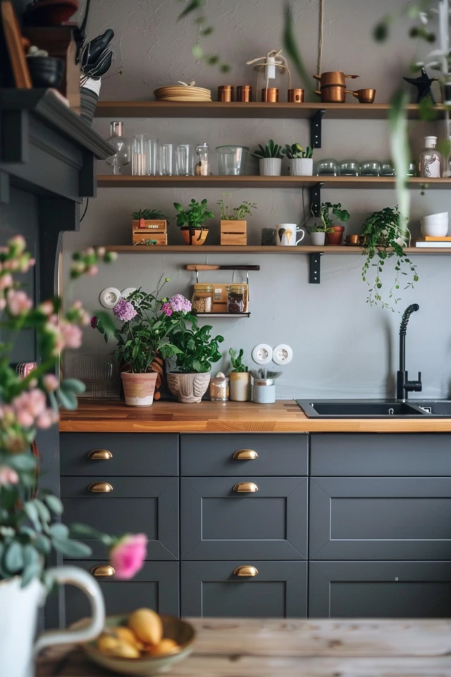
Picture Gallery


