
Perfect Wall Colors for Gray Kitchen Cabinets
Choosing the right wall color for a kitchen with gray cabinets is deceptively difficult. While gray is neutral, it is rarely just a simple mix of black and white. It acts like a chameleon, picking up colors from your floors, your lighting, and even the greenery outside your window.
I have walked into countless renovations where a homeowner picked a “safe” beige wall color, only to find their beautiful gray cabinets suddenly looked purple or dingy. The secret lies in identifying the undertones and knowing how to manipulate contrast to get the vibe you want.
Whether you are looking for a high-contrast modern look or a soft, monochromatic sanctuary, the right paint transforms the cabinetry from background noise to a focal point. For more inspiration, you can jump straight to our curated Picture Gallery at the end of this post.
Understanding Undertones Before You Paint
Before we look at specific colors, you have to diagnose your cabinets. Gray paint always has an undertone—usually blue, green, or violet (cool grays), or beige and taupe (warm grays).
If your cabinets are a cool, steely gray, they likely have blue undertones. If you pair them with a yellow-based cream wall, the cabinets will look surprisingly blue, and the walls will look dirty. This is the most common mistake I see in DIY kitchen makeovers.
To test this, hold a sheet of pure white printer paper against your cabinet door. If the gray looks steel-like or icy, it is cool. If it looks muddy or like a stone found in a river, it is likely warm with green or brown undertones. You must pair cool cabinets with cool wall colors, or deliberate high-contrast warm tones, but avoid mixing tones blindly.
Designer’s Note: The Lighting Lesson
I once designed a kitchen with “Agreeable Gray” walls and charcoal cabinets. In the showroom, it looked perfect. In the client’s north-facing kitchen, the walls turned icy lavender. Why? North-facing light casts a blue hue.
The lesson: Always test your paint samples on two different walls—one that gets direct light and one that stays in shadow. Watch them for 24 hours. If you have north-facing windows, lean toward slightly warmer whites to counteract the blue natural light. If you have south-facing windows, almost any color will look truer to the swatch.
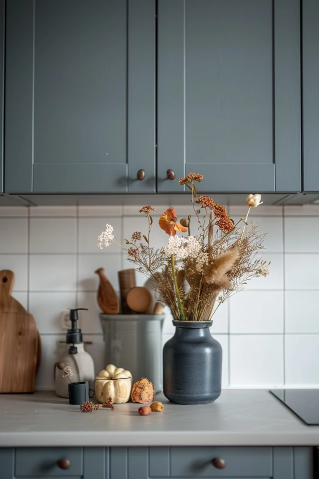
Option 1: Crisp Whites for a Modern, Clean Look
If you want your kitchen to feel expansive, airy, and clean, white walls are the professional standard. However, you cannot just grab the first can of “white” off the shelf.
For cool gray cabinets (blue-based), you need a crisp, stark white. Look for paints with very little yellow in them. This creates a high-contrast, gallery-like feel that makes the cabinetry pop. A pure white wall helps reflect light, which is crucial if your gray cabinets are on the darker charcoal side.
For warm gray or “greige” cabinets, a sterile white will look too harsh. Instead, opt for a creamy off-white or a soft ivory. This bridges the gap between the cabinets and the rest of the room, creating a seamless, cozy transition.
Recommended Finishes:
- Walls: Satin or Eggshell. These finishes are scrubbable, which is non-negotiable in a cooking zone. Flat paint holds onto grease and spaghetti sauce splatters.
- Trim and Ceiling: Semi-gloss or High-gloss. This subtle shine difference adds architectural interest even if the color is the same as the wall.
Option 2: Moody Contrasts with Navy and Black
If you have a large kitchen or high ceilings, white walls might feel boring. Pairing gray cabinets with a darker wall color creates instant drama and sophistication.
Deep navy blue is a spectacular companion for light gray or “dove gray” cabinets. The blue emphasizes the cool undertones in the gray, making the cabinets look crisp and expensive. This combination works exceptionally well with brushed brass or gold hardware, as the warm metal pops against the cool backdrop.
Matte black or charcoal walls are another bold choice. This creates a monochromatic, moody aesthetic. This works best if you have light-colored countertops (like white quartz or marble) and a light-colored backsplash. The light horizontal surfaces prevent the room from feeling like a cave.
The Lighting Constraint:
Do not attempt dark walls if your kitchen relies on a single ceiling fixture. Dark paint absorbs light. To make this work, you need:
- Under-cabinet lighting: To illuminate the workspace.
- 3000K to 4000K bulbs: Warm white or cool white bulbs ensure the dark walls don’t look muddy. Avoid 2700K (too yellow) or 5000K (too blue/clinical).
Option 3: Warm Earth Tones and Terracotta
Gray has a reputation for feeling cold or industrial. If you want to soften the space and make it family-friendly, look to earth tones.
Terracotta, muted rust, or dusty pinks are trending heavily in interior design right now. These warm, red-based colors sit opposite green-based grays on the color wheel. This is basic color theory: opposites attract. The red tones in a terracotta wall will make green-gray cabinets look incredibly rich and intentional.
Sand and beige tones also work, but proceed with caution. You want a beige that leans toward a “mushroom” or “taupe” color rather than a yellow-butter color. A yellow-beige paired with gray often creates a clash that feels dated.
Texture Matters:
When using earth tones, I like to introduce texture. Consider a lime wash paint or a roman clay finish. The subtle movement in the texture breaks up the flatness of the wall and adds an organic, lived-in feel that pairs beautifully with the sleekness of painted cabinetry.
Option 4: Monochromatic Greige (Tone-on-Tone)
The “tone-on-tone” look is very high-end and surprisingly easy to execute. This involves painting the walls a shade of gray that is just two or three steps lighter than your cabinets.
This technique removes visual clutter. Because the eye doesn’t stop at the line where the cabinet meets the wall, the ceilings feel higher and the room feels larger. It creates a soothing, wrap-around effect that is perfect for open-plan homes where the kitchen bleeds into the living room.
To get this right, you must stay in the exact same color family. If your cabinets are a warm “French Gray,” your walls should be a diluted version of that same warm gray. Do not mix a cool gray wall with a warm gray cabinet here; it will look like a mistake rather than a design choice.
How to pick the shade:
Grab the color strip for your cabinet paint. If your cabinets are the darkest color at the bottom of the strip, pick the second or third color down from the top for your walls. Paint manufacturers organize these strips by undertone, so they have already done the matching work for you.
Option 5: Soft Sage and Biophilic Greens
Bringing the outdoors in is a timeless strategy. Soft sage green or a muted olive green pairs wonderfully with mid-tone gray cabinets.
This combination feels organic and calming. It is particularly effective in kitchens with windows looking out onto a garden or backyard, as the wall color visually pulls the greenery inside.
For this look, avoid neon or “apple” greens. You want “dusty” greens that have a bit of gray in them already. This shared gray base ensures the two colors harmonize rather than fight for attention.
Material Coordination:
This palette screams for natural wood accents. If you have gray cabinets and green walls, add a butcher block island, floating oak shelves, or woven wooden blinds. The warmth of the wood balances the coolness of the gray and green, grounding the entire design.
Common Mistakes + Fixes
Even experienced renovators make blunders when dealing with gray. Here are the most common issues I fix in client homes.
Mistake: Ignoring the Countertops
People often hold paint chips against the cabinet but forget the horizontal surface that connects them.
The Fix: Your wall color must harmonize with the veining in your countertop. If your quartz has warm brown veins, a cool blue-gray wall will clash. Place your paint sample directly on the counter to check the transition.
Mistake: Choosing Paint Last
Painting is the final step of renovation, but choosing the color should happen early.
The Fix: Do not pick a wall color until you have selected your backsplash tile. There are thousands of paint colors but only a limited selection of tiles. It is much easier to color-match paint to a tile than the other way around.
Mistake: The “Landlord Special” Sheen
Using flat paint in a kitchen to hide drywall imperfections.
The Fix: Kitchens are wet, messy zones. You need a finish that seals the drywall. Use a high-quality “Scuff-X” or similar durable satin finish. If your drywall is rough, spend the money on a skim coat or textured wallpaper rather than using non-washable paint.
What I’d Do in a Real Project: A Mini-Checklist
If I were standing in your kitchen today, this is the exact process I would follow to select your wall color.
1. Identify the Cabinet Undertone
I would place a pure white sheet of paper against the cabinet door.
Blue/Purple cast? It’s Cool.
Green/Brown/Yellow cast? It’s Warm.
2. Assess the “Fixed Elements”
I would look at the floors and the countertops. Are they warm (oak floors, cream granite) or cool (concrete floors, Carrara marble)? The wall color must bridge the cabinets and these fixed elements.
3. Order Large Peel-and-Stick Samples
I never rely on the small 2-inch cards from the hardware store. I order 12×12 inch peel-and-stick samples (like Samplize) or paint a large poster board.
4. The “Corner Test”
I place one sample next to the cabinet molding and another next to the backsplash. I never place the sample in the middle of a blank wall, as the existing wall color will trick the eye and skew the result.
5. The 24-Hour Watch
I leave the samples up for a full day. I check them with morning coffee (natural eastern light), while cooking dinner (overhead artificial light), and at night (ambient mood lighting). If the color looks good in all three scenarios, it is a winner.
Final Checklist for Your Project
Before you head to the paint store, run through this quick list to ensure you have everything covered.
- Undertone Match: Have you confirmed if your gray cabinets are warm or cool?
- Sample Size: Do you have a large sample (at least 1 foot square) to test?
- Sheen Selection: Are you buying Satin or Eggshell for walls, and Semi-Gloss for trim?
- Lighting Check: Have you checked the color with your kitchen lights turned on at night?
- Ceiling Consideration: Are you painting the ceiling bright white (for height) or the same color as the walls (for coziness)?
- Quantity Calculation: Did you measure the square footage and subtract cabinets/windows? (Always buy 10% extra for touch-ups later).
Frequently Asked Questions
Should I paint my ceiling the same color as the walls in a gray kitchen?
In a small kitchen, painting the ceiling bright flat white is usually best to make the room feel taller. However, if you have high ceilings (over 9 feet) and are using a light white or off-white on the walls, painting the ceiling the same color wraps the room and feels very custom.
What color hardware looks best with gray cabinets?
This depends on the wall color. If you choose white walls, Matte Black hardware creates a striking, modern graphic look. If you choose navy or dark walls, Brushed Brass or Gold hardware reflects light and adds necessary warmth. Polished Chrome is the “safe” choice that works with everything but adds less personality.
I rent my home. How can I fix the wall color without painting?
If you cannot paint, focus on large-scale art or peel-and-stick wallpaper. A large canvas with the right colors can break up a bad wall color. Alternatively, adding a large runner rug that complements the gray cabinets can draw the eye down and distract from clashing walls.
How does the backsplash affect my wall color choice?
The backsplash is the bridge between the cabinet and the wall. If your backsplash is busy or colorful, your wall paint should be neutral and understated to avoid visual chaos. If your backsplash is a simple white subway tile, you have the freedom to go bold with your wall color.
Conclusion
Gray kitchen cabinets are a fantastic investment because of their versatility. They can shift from farmhouse to modern industrial just by changing the wall color surrounding them.
The most important takeaway is to respect the undertone. Once you know if your gray is warm or cool, the decision-making process becomes logical rather than a guessing game. Test your samples, watch the light, and don’t be afraid to go a little darker for contrast or stick to clean whites for timeless appeal.
Your kitchen is the heart of the home, and the right background color makes the heartbeat a little stronger. Take your time with the samples—the perfect shade is worth the patience.
Picture Gallery


