
Revamp Your Space with Blue Gray Living Room Ideas
Blue gray is arguably the most versatile chameleon in the interior design world. It bridges the gap between the cool tranquility of blue and the sophisticated neutrality of gray, making it suitable for everything from coastal cottages to moody, modern apartments. However, getting this color right requires a bit of strategy, as lighting conditions can drastically shift how the paint reads on your walls.
I recently worked with a client who was terrified of color but bored with her builder-grade beige walls. We settled on a mid-tone blue gray, and the transformation was immediate; the room felt cozy at night yet airy during the day. If you are looking for visual inspiration, you can access our curated Picture Gallery at the end of this blog post.
This guide will walk you through the practical steps of designing a living room around this color palette. We will cover lighting, layout, texture, and the specific measurements you need to make the space functional.
1. Mastering the Light: Why Undertones Matter
The biggest challenge with blue gray is that it is rarely just one static color. It shifts based on the natural light your room receives and the artificial light you introduce.
If you have a north-facing room, the light coming in is naturally cool and bluish. Placing a cool blue gray here can make the room feel icy or clinical. In these spaces, you need a blue gray with a slight green or warm gray undertone to counteract the chill.
Conversely, south-facing rooms get warm, yellow light. This light will neutralize the blue, often making the color appear more like a true gray or even washing it out completely. Here, you can afford to go with a richer, deeper blue gray to hold its own against the sun.
Designer’s Note: The 24-Hour Test
I never let a client buy gallons of paint without testing it first. Paint a 2-foot by 2-foot square on two different walls: one that gets direct light and one that stays in the shadow. Watch how the color changes in the morning, at noon, and under your lamps at night. If it turns purple in the evening (a common issue with cheap pigments), ditch it.
Artificial Lighting Rules
Your light bulbs will make or break this look.
- Avoid cool white bulbs (4000K+): These will turn your blue gray walls into a hospital waiting room.
- Stick to 2700K or 3000K: Soft white (2700K) adds warmth, while bright white (3000K) offers a neutral clarity.
- Layer your lighting: Relying on a single overhead fixture flattens the color. Use floor lamps and table lamps to create pockets of warmth.
2. Balancing Temperature with Materials
A room painted blue gray carries a “cool” visual temperature. To make the space livable and inviting, you must introduce “warm” elements to create balance. If you pair blue gray walls with a gray sofa and chrome hardware, the room will feel uninviting.
Wood Tones
Wood is the easiest way to warm up a cool room.
- Walnut and dark stains: These provide high contrast and a mid-century modern or traditional feel. The rich reds and browns in the wood pop against the blue backdrop.
- White Oak and lighter stains: These create a Scandinavian or coastal vibe. It keeps the room feeling light but adds necessary organic grain.
- Avoid gray-washed wood: This is a common mistake. Gray floors with blue gray walls result in a visual washout.
Metals and Hardware
Hardware acts like jewelry for the room.
- Unlacquered Brass or Gold: The yellow tones in brass sit opposite blue on the color wheel. This complementary pairing is vibrant and luxurious.
- Matte Black: This offers a modern, industrial edge that grounds the airy nature of blue gray.
- Polished Nickel: If you want to keep the room cool and sophisticated, nickel works better than chrome because it has a subtle warm undertone.
Common Mistake + Fix
Mistake: Using bright white furniture and high-gloss white trim with no texture.
Fix: Use an off-white or cream for upholstery. For trim, stick to a crisp white but ensure you have textured throw pillows or a wood coffee table to break up the “cold” blocks of color.
3. Furniture Selection and Layout Logistics
When working with a specific color mood, the scale and placement of your furniture define the room’s functionality. Blue gray is a receding color, meaning it can make walls feel further away. This is great for small spaces, but it means your furniture needs to ground the room.
Sofa Selection
Since the walls are the star, your sofa should either blend in or stand out intentionally.
- The Neutral Route: A beige, oatmeal, or cognac leather sofa allows the walls to provide the color. This is the safest bet for longevity.
- The Monochromatic Route: A navy blue velvet sofa creates a moodier, tone-on-tone look. This is high drama and works well in media rooms.
- Fabric Durability: If you have kids or pets, look for “performance velvet” or fabrics with a tight weave. Blue gray walls hide scuffs well, but your sofa needs to handle the traffic.
Key Measurements for Flow
No matter the color, a living room fails if the layout is cramped.
- Coffee Table Distance: Keep 14 to 18 inches between the edge of the sofa and the coffee table. This is enough room to walk through but close enough to set down a drink.
- Walkways: Main traffic paths should be 30 to 36 inches wide. Don’t block the flow from the hallway to the window.
- Rug Sizing: A common error is a rug that is too small, making the furniture look like it is floating on an island. Ensure the front legs of all seating furniture (sofa and accent chairs) are resting on the rug. Ideally, the rug should extend 6 to 10 inches past the sides of the sofa.
4. Textures and Textiles: Avoiding the “Flat” Look
A blue gray room without texture looks sterile. Texture adds shadow and depth, which tricks the eye into seeing a cozier space. This is especially important for renters who might not be able to paint and are relying on blue gray furniture or decor to set the tone.
Window Treatments
Drapery adds a vertical line that heightens the room and softens the acoustics.
- Fabric Choice: Linen or heavy cotton blends hang beautifully. Avoid shiny synthetic polyester, which can look cheap against matte paint.
- Color: Crisp white curtains offer a breezy contrast. Charcoal gray curtains add drama. Avoid matching the curtain color exactly to the wall color unless you are going for a very specific, ultra-modern “color drenching” look.
- Placement: Hang the curtain rod 4 to 6 inches above the window frame (or just below the ceiling molding) to make the ceilings feel taller. Extend the rod 8 to 12 inches past the window width so the curtains don’t block the glass when open.
Layering Rugs
For an elevated look, consider layering rugs.
- Base Layer: Start with a large natural fiber rug, like jute or sisal. The tan color warms up the blue gray palette.
- Top Layer: Add a smaller, patterned vintage-style rug or a hide on top. This adds pattern without overwhelming the space.
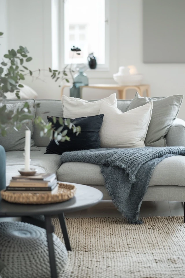
What I’d Do in a Real Project: The Pillow Formula
I use a specific formula to style sofas so they don’t look messy.
1. Corners: Two 22-inch square pillows in a solid color or subtle texture.
2. Inner: Two 20-inch square pillows in a pattern that incorporates the wall color.
3. Center (Optional): One rectangular lumbar pillow in a contrasting fabric, like leather or boucle.
5. Paint Finishes and Accent Walls
Selecting the color is only half the battle; the finish affects durability and how the light hits the pigment.
Choosing the Right Sheen
- Flat/Matte: Best for ceilings and low-traffic areas. It hides drywall imperfections beautifully but is hard to clean. Modern “scrub-able matte” paints exist, but they are pricier.
- Eggshell: The industry standard for living room walls. It has a slight velvety sheen that reflects a tiny amount of light and is wipeable.
- Satin/Semi-Gloss: Reserve this for baseboards, window trim, and doors. The higher shine highlights the architectural details and creates a nice contrast against eggshell walls.
The Accent Wall Debate
Is the accent wall dead? Not necessarily, but it has evolved. Instead of painting one random wall blue gray, consider painting the millwork.
- Built-ins: If you have bookshelves, painting them a deep blue gray while keeping the walls neutral creates a stunning focal point.
- Wainscoting: Paint the bottom third of the wall (wainscoting or beadboard) in blue gray and leave the top white. This grounds the room and is great for high-traffic families since darker paint hides scuffs better than white.
- Color Drenching: For a bold look, paint the walls, trim, and baseboards the same blue gray color. Use eggshell for the walls and satin for the trim. This makes the ceiling feel higher and the room feel custom-designed.
6. Styling for Real Life: Pets, Kids, and Clutter
A beautiful room that you can’t live in is useless. Blue gray is actually a practical choice for busy households because it is forgiving.
Hiding the Mess
Medium-tone blue gray hides fingerprints better than white and dust better than black. It is the pragmatic middle ground.
Kid-Friendly Storage
Incorporate storage that blends with the palette.
- Ottomans: Swap a hard coffee table for a large leather or upholstered ottoman in a contrasting color. It serves as a footrest, a coffee table (with a tray), and safe edge protection for toddlers.
- Baskets: Use woven baskets for toy storage. The natural wood tone of the basket contributes to the “warming” effect we discussed earlier.
Pet Considerations
If you have shedding pets, match your rug to your pet, not just your paint. A dark navy rug will show every golden retriever hair. A light cream rug will show muddy paws. A patterned rug with blue, gray, and beige tones is the ultimate camouflage for pet owners.
Final Checklist: The Pro Approach
If I were consulting on your living room today, here is the exact checklist I would run through before we bought a single item:
- Test the Paint: Did you paint a large swatch and check it at 8:00 PM?
- Check the Bulbs: Are all lamps fitted with 2700K or 3000K bulbs?
- Measure the Rug: Does the rug fit under the front legs of the sofa with room to spare?
- Warmth Check: Do you have at least three wood or brass elements in the room?
- Texture Count: Do you have at least three different fabric textures (e.g., velvet, linen, leather)?
- Flow Check: Is there a clear 30-inch path for walking through the room?
FAQs
Does blue gray paint make a room look small?
Generally, cool colors like blue gray recede, making walls feel further away, which can actually make a room feel larger. However, dark charcoal-blue shades absorb light. If your room is small, stick to light-to-mid tones or ensure you have excellent lighting.
Can I mix blue gray with beige furniture?
Absolutely. In fact, beige is one of the best pairings for blue gray. The warmth of the beige counteracts the coolness of the walls. It creates a “greige” harmony that feels organic and spa-like.
What color curtains go with blue gray walls?
Crisp white is the classic choice for a fresh, clean look. If you want something moodier, try a tonal look with curtains that are two shades darker than the wall. For a bold contrast, mustard yellow or terracotta velvet curtains look incredible in eclectic spaces.
Is gray going out of style?
Flat, builder-grade gray is on the decline. However, blue gray is considered a timeless color, much like navy or sage green. It has enough pigment to feel like a “color” rather than just a default neutral, giving it staying power in design trends.
Conclusion
Revamping your living room with blue gray ideas is about more than just picking a paint chip. It is about creating an ecosystem of textures, lighting, and layout that works together. By balancing the cool undertones with warm woods and brass, and ensuring your furniture layout facilitates conversation, you can create a space that feels both sophisticated and inviting.
Don’t be afraid to experiment with the depth of the color. Whether you choose a whisper-soft mist or a stormy slate, the principles of scale, lighting, and texture remain the same.
Picture Gallery


