
Soothing Blue and Grey Bedroom Ideas for You
Designing a bedroom is about more than just picking a pretty color palette; it is about engineering a feeling. When clients come to me looking for a sanctuary that feels calm, grounded, and timeless, I almost always steer them toward the combination of blue and grey. This pairing mimics the most relaxing elements of nature—stormy skies, river rocks, and ocean horizons—making it the ultimate choice for deep rest.
However, getting this look right requires a bit more nuance than simply buying navy sheets and painting the walls silver. Without the right textures and lighting, this cool-toned palette can quickly turn sterile or depressing. For a huge dose of visual inspiration, scroll down to the Picture Gallery at the end of this blog post.
In this guide, I will walk you through the exact process I use to build a blue and grey bedroom that feels warm and inviting. We will cover paint undertones, furniture scaling, lighting temperature, and the tactile layers necessary to make the space liveable. Whether you are doing a full renovation or a weekend refresh, these professional principles will help you get it right the first time.
1. Mastering Undertones and Natural Light
The most common mistake DIYers make with blue and grey is ignoring the undertones. Grey is rarely just “grey.” It usually leans towards blue (cool), green (neutral), or violet/brown (warm). If you paint a north-facing room a cool, blue-based grey, the lack of warm natural light will make the room feel like a refrigerator.
The Rule of Thumb for Lighting:
Before buying a gallon of paint, determine the direction your windows face.
- North-facing rooms: These get cool, indirect light. You need to counterbalance this with “warm” greys (greige or taupe-based) or warmer blues that have a hint of green (like teal or Aegean).
- South-facing rooms: These get warm, golden light. You can get away with cooler, truer blues and slate greys because the sun will naturally warm them up.
Designer’s Note: The “Piece of Paper” Trick
When you look at a paint swatch in the store, it looks different than it will on your wall. To see the true undertone, place the paint chip on a pristine sheet of white printer paper. Suddenly, that “neutral” grey might look shockingly purple or green. Do this before you ever put a sample on the wall.
Creating Contrast
A monochrome room can fall flat if there isn’t enough variance in the Light Reflectance Value (LRV). If your walls are a mid-tone grey and your bedding is a mid-tone blue, the room will look muddy.
I always aim for high contrast. If the walls are dark charcoal (low LRV), the bedding should be crisp white or pale sky blue. If the walls are a whisper-soft mist blue, ground the room with a dark slate grey headboard or rug.
2. Wall Treatments and Paint Finishes
Once you have your colors selected, you need to decide how to apply them. In a bedroom, the goal is softness. High-gloss finishes are generally too stimulating for a sleeping space unless used very intentionally on trim.
My Go-To Finishes:
- Walls: Flat or Matte. This absorbs light rather than reflecting it, creating a velvety, soft texture that hides drywall imperfections.
- Trim and Doors: Satin or Eggshell. This provides just enough durability for scrubbing off scuffs without creating a jarring shine.
The Color Drenching Technique
If you want a modern, high-end look, stop painting your trim white. When I design moody blue bedrooms, I often use “color drenching.” This means painting the baseboards, window casings, and doors the exact same color as the walls.
This technique does two things. First, it makes the ceilings feel higher because your eye doesn’t get stopped by a white stripe at the floor. Second, it creates an immersive, cocoon-like effect that is perfect for sleeping.
Common Mistakes + Fixes
Mistake: An accent wall that feels disconnected.
Fix: If you paint one wall navy blue and leave the other three white, it can look unfinished. Instead, try painting the ceiling the same color as the accent wall to wrap the room, or ensure the other three walls are a soft grey rather than stark white to bridge the gap.
3. Textiles: The Secret to Warmth
Blue and grey are inherently “cool” colors. To prevent the room from feeling clinical, you must introduce warmth through texture. This is the stage where a house becomes a home.
The Bedding Equation
Never rely on a single comforter set in a bag. A designer bed is built in layers. Here is the formula I use for almost every project:
- Sheets: crisp white or light grey percale.
- Coverlet/Quilt: A thin layer with texture (waffle weave or matelassé) tucked in tight.
- Duvet: Fluffy and folded at the foot of the bed. If your walls are grey, make this navy or denim blue.
- Throw Blanket: Wool or chunky knit, draped casually.
Rug Sizing and Placement
A rug is mandatory in a bedroom with hard floors, especially with a cool color palette. It anchors the bed and provides acoustic dampening.
Measurements to Know:
- King Bed: Use a 9×12 rug. You want at least 18 to 24 inches of rug showing on both sides of the bed.
- Queen Bed: An 8×10 rug is usually perfect.
- Placement: Do not push the rug all the way to the nightstands. Start the rug about 6 to 12 inches away from the nightstand face so your feet land on it when you get out of bed, but the heavy nightstands don’t cause it to buckle.
For Pet Owners:
Blue and grey are excellent for hiding pet fur, but the weave matters. If you have a cat, avoid loop-pile rugs (like Berber) which snag easily. Go for a cut-pile wool or a vintage-style printed rug. These hide accidents and hold up to claws.
4. Wood Tones and Metal Finishes
Because blue and grey are on the cool side of the color wheel, you need wood tones to introduce organic warmth. If you use black or white furniture with blue walls, the room can feel stark.
Wood Tone Pairings
- Walnut (Dark/Warm): This is the gold standard for blue rooms. The richness of walnut pops beautifully against slate blue or charcoal grey.
- White Oak (Light/Neutral): This works best with lighter, airy palettes—think “California Coastal.” Pair white oak with mist blue and pebble grey.
- Espresso (Very Dark): Be careful here. Dark wood on dark walls can disappear. Only use espresso furniture if your walls are a very light grey.
Mixing Metals
Do not feel the need to match every metal finish. In fact, mixing them looks more curated.
What I’d Do in a Real Project:
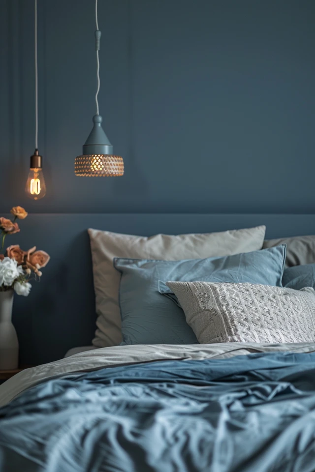
If I have grey walls and a blue velvet headboard, I will likely use unlacquered brass or antique gold for the lighting fixtures. The yellow undertone of the gold neutralizes the chill of the grey.
If you prefer silver tones, choose polished nickel over chrome. Nickel has a warmer, champagne-like undertone, whereas chrome is very blue and cold. Matte black hardware is also a safe, modern choice that adds a graphic punch to the room.
5. Lighting: The Kelvin Scale Matters
You can pick the perfect paint color, but the wrong light bulb will ruin it. In interior design, we measure light temperature in Kelvins.
The Only Bulb You Should Buy
For a bedroom, stick to 2700K (Soft White) or 3000K (Warm White).
If you buy “Daylight” bulbs (4000K-5000K), your blue walls will look commercial, and your grey walls will look like concrete. Blue light suppresses melatonin, which is the opposite of what you want in a bedroom. 2700K bulbs mimic the warm glow of firelight, making blue walls feel cozy and rich.
Layering Your Light Sources
Overhead lighting is generally unflattering. I advise clients to treat the ceiling fan or main fixture as decoration and rely on lamps for actual illumination.
- Bedside Lamps: The bottom of the lampshade should be roughly eye-level when you are sitting up in bed reading. This usually means a lamp height of 28-32 inches if your nightstand is standard height.
- Sconces: If you are tight on space, wall sconces are a lifesaver. Mount them about 60 to 66 inches off the floor. This clears your head when sitting up but keeps the light focused on your book.
6. Window Treatments
Curtains add verticality and softness. In a blue and grey room, window treatments are an opportunity to bridge the gap between your wall color and your furniture.
Fabric Selection
If your walls are blue, try a grey textured linen curtain. If your walls are grey, a navy velvet curtain adds incredible drama and doubles as soundproofing.
Hanging Rules
Height: Mount your curtain rod 4 to 6 inches below the ceiling crown molding, not right above the window frame. This draws the eye up and makes the room feel taller.
Width: The rod should extend 10 to 12 inches past the window frame on each side. When the curtains are open, they should sit against the wall, not blocking the glass. This maximizes natural light, which is crucial for keeping grey rooms feeling happy, not gloomy.
Final Checklist: The Blue & Grey Blueprint
Before you finalize your room, run through this checklist to ensure you have hit all the functional and aesthetic marks.
- Undertone Check: Did I check my grey paint against a white piece of paper to see if it leans purple or green?
- Lighting Temp: Are all my bulbs 2700K or 3000K to prevent the room from looking like a hospital?
- Texture Count: Do I have at least three different textures? (e.g., velvet headboard, linen sheets, wool rug).
- Wood Contrast: Did I include a wood element (nightstand, bench legs, dresser) to warm up the cool colors?
- Rug Scale: Does my rug extend at least 18 inches on either side of the bed?
- Curtain Height: Is the curtain rod mounted high, near the ceiling, rather than resting on the window frame?
- Greenery: Do I have one plant (real or faux) to add life to the cool palette?
FAQs
Q: Can I use blue and grey in a small bedroom without making it feel smaller?
A: Absolutely. Dark colors can actually blur the corners of a room, creating an illusion of infinite space. If you are nervous, paint the walls a light dove grey and use a large navy area rug to ground the space. Keep bedding light to bounce light around.
Q: How do I keep a grey bedroom from looking boring?
A: Pattern and metal accents are key. Add a throw pillow with a geometric print or a subtle stripe. Incorporate a brass mirror or gold lamp bases. Grey is a backdrop; it relies on the “jewelry” of the room to shine.
Q: What is the best accent color for blue and grey?
A: Mustard yellow or burnt orange creates a stunning mid-century modern look. For something softer and more feminine, try blush pink or dusty rose. If you want a masculine or earthy vibe, introduce cognac leather.
Q: Should my nightstands match my dresser?
A: In modern design, we try to avoid “bedroom sets.” If your dresser is a painted grey finish, try wood nightstands. If your bed frame is wood, try painted or metal nightstands. The variance makes the room feel custom-designed.
Conclusion
Creating a soothing blue and grey bedroom is about balance. You are balancing cool tones with warm textures, dark walls with light bedding, and functional layout with soft aesthetics.
Trust the process of layering. Start with the right paint undertone, add warmth through wood and brass, and finish with tactile textiles that beg you to touch them. When done correctly, this color palette offers a retreat that feels sophisticated, serene, and deeply personal.
Picture Gallery


