
Title: Stylish Kitchen Floor Tile Ideas with White Cabinets
Introduction
White cabinets are the ultimate chameleon of interior design. They can feel modern, farmhouse, traditional, or coastal depending entirely on what you pair them with. However, this versatility often leads to “decision paralysis” because the options feel endless. The floor is the second largest surface area in your kitchen, meaning its relationship with your cabinetry will dictate the entire mood of the room.
I have seen many DIY renovations go sideways because a homeowner assumed “white matches everything.” In reality, the wrong floor tile can make expensive white cabinets look yellow, dingy, or clinically sterile. The secret lies in understanding undertones, texture, and scale before you ever buy a box of tile.
In this guide, I will walk you through the specific tile pairings that work best with white cabinetry, complete with installation tips and maintenance realities. If you are just looking for visual inspiration, you can jump right to the Picture Gallery at the end of this blog post.
1. Mastering Undertones: The Secret to Cohesion
Before looking at specific materials, we have to talk about color temperature. White cabinets are rarely “pure” white. They usually lean warm (creamy, yellow-based) or cool (blue, grey-based).
If you pair warm, creamy cabinets with a cool, grey concrete-look tile, the cabinets will look unintentionally yellow. Conversely, stark bright white cabinets can make a beige travertine floor look dirty.
Designer’s Note: The Paper Test
To determine your cabinet undertone, hold a piece of standard printer paper against the cabinet door in natural daylight.
- If the door looks yellowish or soft, you have warm undertones.
- If the door looks crisp or slightly blue, you have cool undertones.
- If it blends perfectly, you have a true neutral white.
Common Mistake: The “Hospital” Effect
Many homeowners choose high-gloss white cabinets and pair them with high-gloss white marble floors. While this looks luxurious in photos, in real life, it feels sterile and cold.
The Fix:
If you want a white-on-white look, vary the textures. Pair glossy cabinets with a honed (matte) floor tile, or use a textured porcelain that mimics fabric or natural stone. Contrast in texture is just as important as contrast in color.
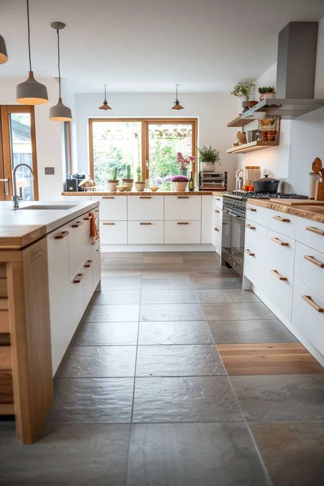
2. High Contrast: Black, Slate, and Charcoal
Creating high contrast is the most effective way to make white cabinets pop. A dark floor grounds the room and draws the eye to the brightness of the cabinetry. This is a classic “tuxedo” look that works exceptionally well in both modern and traditional homes.
Material Options
- Natural Slate: This offers incredible texture and variation. It hides dirt and pet hair exceptionally well. However, natural slate requires sealing and has an uneven surface that can be tough on bare feet.
- Slate-Look Porcelain: This is my preferred choice for high-traffic kitchens. You get the visual depth of slate with a smooth, durable finish that requires zero maintenance.
Scale and Layout
For a modern look, go big. Use large format tiles, such as 12×24 inches or even 24×48 inches.
Install them in a stacked bond (grid) for a contemporary vibe, or a 1/3 offset brick pattern for something more traditional.
Measurements that Matter
When using dark tile, the grout line becomes highly visible if you use a contrasting grout.
- Pro Tip: Use a 1/16-inch grout line (rectified tile required) with a grout color that matches the tile exactly. This creates a seamless, expansive floor look.
- Avoid: Wide 1/4-inch grout lines with white grout on black tile. It creates a checkerboard visual noise that makes the room feel smaller.
3. Wood-Look Porcelain: Warmth Without the Worry
Real hardwood is beautiful, but it is vulnerable to water damage, scratches from dog claws, and dropped pots. Wood-look porcelain tile has become a staple in my design projects because it bridges the gap between aesthetics and durability.
This is the best option if you want to warm up a white kitchen without introducing the yellow tones of natural stone. It brings in an organic element that softens the starkness of the white.
Choosing the Right Shade
With white cabinets, mid-tone wood looks usually work best.
- Blonde/White Oak: Creates a “Scandi” or coastal vibe. Very forgiving with dust.
- Medium Brown/Walnut: The most timeless option. It anchors the room without being as harsh as black tile.
- Grey Wash: Be careful here. Grey wood looks are trending out and can make a space feel dated. If you want grey, go for a greige (grey-beige) that has some warmth to it.
Installation Rules for Realism
The goal is to trick the eye into thinking it is real wood. To do this, you must follow specific layout rules.
1. Avoid the Stair Step
Do not lay the tiles in a perfect stair-step pattern. It looks artificial. Ask your installer for a “random offset” pattern.
2. Mind the Grout Joint
You need the tightest grout joint possible. Aim for 1/16 inch or 1/8 inch max. Use a sanded grout that matches the darkest tone in the wood grain.
3. Check the Repeats
Cheap wood-look tile has a low number of “faces” (patterns). If you buy a cheap box, you will see the exact same knot on the floor every three feet. Look for a product with at least 20+ variations or faces.
4. Natural Stone and Travertine: The Soft Transition
If high contrast feels too bold and wood-look feels too rustic, natural stone is your middle ground. Travertine, limestone, and marble offer a soft, elegant transition that elevates the value of a home.
This look pairs beautifully with “soft white” or “dove white” cabinets. It creates a monochromatic, textural palette that feels expensive and serene.
Travertine Trends
Travertine is making a huge comeback, but not the shiny, unfilled holes of the early 2000s.
- Look for: Honed and filled finishes in “Silver” or “Ivory” cuts.
- Cut Type: “Cross-cut” shows cloud-like patterns, while “Vein-cut” shows linear stripes. Vein-cut silver travertine looks stunningly modern with white flat-panel cabinets.
The Durability Reality
Natural stone is porous. It will stain if you spill red wine or olive oil and let it sit.
- Sealing: You must seal natural stone floors upon installation and re-seal them every 1-2 years.
- Patina: Accept that marble and limestone will scratch and etch over time. If you are Type A and need a perfect floor forever, switch to a stone-look porcelain.
Designer’s Note: Rug Sizing
Stone floors can be cold and hard. You will likely want a runner rug between the island and the main sink run.
- Size Rule: Leave at least 4 to 6 inches of floor visible on all sides of the runner.
- Standard: For a standard 10-foot island, look for an 8-foot or 9-foot runner. A 5-foot rug will look like a postage stamp.
5. Patterned and Encaustic Cement Looks
For those who want the floor to be the “hero” of the kitchen, patterned tiles are the answer. Since white cabinets are neutral, you have the license to go wild on the floor without the room feeling chaotic.
This is particularly effective in smaller kitchens, galley layouts, or laundry rooms where you want to distract from the tight footprint.
Material Choices: Cement vs. Porcelain
- True Cement (Encaustic): These are thick, handmade tiles. They patina beautifully but are high maintenance. They are porous and stain easily. They also require a thicker mortar bed, which can cause height issues with appliances.
- Porcelain “Encaustic-Look”: This is what I recommend for 90% of clients. You get the pattern, but the pattern is printed on durable, impervious porcelain. You can use standard cleaners, and it won’t stain.
Scale of Pattern
- Small Kitchen: Use a smaller, tighter pattern. A massive print can get cut off awkwardly in a narrow room.
- Large Kitchen: You can handle bold, large-scale geometrics.
Color Coordination
Ensure the white in the tile pattern matches your cabinets. If the tile has a creamy background and your cabinets are bright white, the floor will look dirty. Always bring a sample door to the tile showroom.
6. Technical Decisions: Grout, Finish, and Safety
Choosing the tile style is the fun part. The technical specs are what determine if you will hate your floor in six months. Here are the boring but critical details.
Slip Resistance (DCOF)
Kitchens are wet zones. You need traction.
Look at the spec sheet for a rating called DCOF (Dynamic Coefficient of Friction). You want a rating of 0.42 or higher. Anything lower is a slip hazard when water spills.
Matte vs. Polished
- Polished: Shows every water spot, crumb, and smudge. It is slippery. I rarely recommend polished floors for kitchens with kids or dogs.
- Matte/Honed: Hides dust and water spots. Offers better grip.
- Lappato (Semi-Polished): A great compromise that has a slight sheen but offers texture.
The Grout Debate
Never use white grout on a kitchen floor. Period.
Even if you seal it, white grout will eventually turn grey or brown in high-traffic areas (usually right in front of the sink).
My Recommendation:
Go for a light grey, warm beige, or charcoal. If you are using a white marble-look tile, choose a “silver” or “whisper grey” grout. It defines the tile edges and is forgiving of everyday life.
Final Checklist: What I’d Do in a Real Project
If I were designing your kitchen today, this is the checklist I would run through before placing an order.
1. Verify the Undertone
I would place the tile sample vertically (on the toe kick) and the cabinet sample above it. I would look at it at 8:00 AM, 12:00 PM, and 8:00 PM with the lights on.
2. Check the Appliance Clearance
If you are tiling over an existing floor (layering), will your dishwasher still fit under the counter? Will the refrigerator clear the upper cabinets? Tile adds 3/8″ to 3/4″ of height.
3. Order 15% Overage
Industry standard is 10%, but for specific patterns like herringbone, you need 15% to 20% extra for waste cuts.
4. Plan the Transitions
How does the tile meet the living room floor? Avoid cheap metal transition strips. Ask your contractor for a Schluter strip or a flush hardwood transition.
5. Buy the Grout and Caulk Together
Ensure you buy a color-matched caulk from the same manufacturer as your grout. You will need caulk (not grout) where the floor meets the cabinetry toe kick to prevent cracking.
FAQs
Should kitchen floor tile be lighter or darker than the white cabinets?
There is no hard rule, but contrast is usually better. If the floor is the exact same value (lightness) as the cabinets, the room floats. A floor that is slightly darker grounds the space. If you go lighter, ensure the texture is different.
Is herringbone tile a fad?
Herringbone is a classic layout pattern that has been around for centuries (think Parisian apartments). While it is “trendy” right now, it is historically rooted and unlikely to look dated, especially if used with a classic material like brick or wood-look tile.
Can I use large format tiles in a small kitchen?
Yes! In fact, larger tiles make a small room feel bigger because there are fewer grout lines to break up the visual field. A 12×24 inch tile is a great standard size for small kitchens.
How do I warm up a kitchen with white cabinets and grey tile?
If you are stuck with this combination and it feels cold, add natural textures elsewhere. Use wood cutting boards, a woven runner rug, rattan counter stools, or brass hardware. These warm elements counteract the cool grey and white.
Conclusion
Pairing floor tile with white cabinets is about balancing temperature and texture. Whether you choose the drama of black slate, the warmth of wood-look porcelain, or the elegance of travertine, the goal is to create contrast that feels intentional.
Remember that the most stylish kitchen is one that functions for your lifestyle. Prioritize slip resistance and maintenance just as much as aesthetics. A beautiful floor that you are terrified to walk on is not a successful design. Take your time, order samples, and look at them in your specific lighting conditions.
Picture Gallery


