
Teal and Grey Living Room Decor Inspirations
You might think combining a cool neutral with a bold jewel tone is a risky move, but teal and grey is actually one of the most forgiving palettes in interior design. It strikes a balance that few other combinations can achieve. The grey grounds the space, providing a modern, sophisticated backdrop, while the teal injects personality and depth without the aggression of a bright red or orange.
I recently worked on a downtown apartment where the client was terrified of color but hated her “all-beige” box. We introduced a charcoal grey sectional and deep teal accent chairs, and the room instantly felt expensive and intentional. If you are looking for visual examples to spark your creativity, I have curated a comprehensive Picture Gallery at the end of the blog post.
In this guide, I will walk you through exactly how to execute this look. We will cover paint undertones, fabric durability for families, specific layout measurements, and lighting tricks that keep teal from looking muddy at night.
1. Mastering the Undertones: Why Shade Matters
The biggest mistake DIYers make is grabbing a generic “grey” paint and a “teal” pillow and hoping they match. Color theory is critical here because both grey and teal are chameleons.
Grey is rarely just black and white. It usually carries an undertone of blue (cool), green (cool), violet (cool), or beige/yellow (warm). If you choose a “greige” (warm grey) and pair it with a very blue-heavy teal, the grey can start to look dirty or pinkish in comparison.
Teal also sits on a spectrum. It ranges from a green-heavy peacock to a blue-heavy cerulean. To get a cohesive look, you need to decide on the “temperature” of the room.
Designer’s Note: The Lighting Lesson
I once painted a north-facing living room in a cool, blue-based grey. Because north-facing light is already cool and bluish, the walls turned an icy, clinical blue, not the soft grey the client wanted.
If your room faces north or east, use a “warm grey” (one with brown or beige undertones) to embrace the teal without freezing the room out. If your room faces south or west and gets golden afternoon sun, you can get away with cooler, steel greys.
Common Mistakes + Fixes
- The Mistake: Matching saturation levels perfectly.
- The Fix: Create contrast. If your teal is dark and moody, keep your light grey airy. If your grey is dark charcoal, use a punchier, brighter teal or a very muted, dusty teal.
- The Mistake: Ignoring the floor color.
- The Fix: If you have honey-oak floors (warm/orange), a blue-grey wall will make the floor look more orange. Stick to neutral greys to neutralize the wood.
2. Balancing the Palette: The 60-30-10 Rule
You cannot just throw 50% grey and 50% teal into a room; it will feel like a sports team logo. In design, we use the 60-30-10 rule to ensure the eye has a place to rest.
Scenario A: The Safe & Serene (Grey Dominant)
This is best for resale value or people who like to change decor often.
- 60% (Main Color): Light to mid-tone grey. This applies to walls, large area rugs, and perhaps the main sofa.
- 30% (Secondary Color): Teal. Use this for accent chairs, curtains, or a painted feature wall (or joinery/built-ins).
- 10% (Accent): Wood, brass, or black. This adds definition.
Scenario B: The Moody & Bold (Teal Dominant)
This creates a cocoon-like effect, perfect for media rooms or cozy dens.
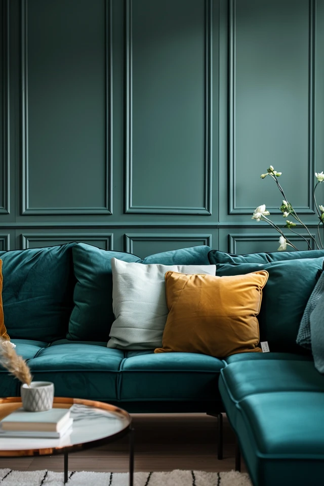
- 60% (Main Color): Deep muted teal or peacock blue. This goes on the walls (color drenching) or a large velvet sectional.
- 30% (Secondary Color): Grey. Use light grey rugs, throws, or artwork to break up the darkness.
- 10% (Accent): Gold or mustard yellow. These colors pop incredibly well against dark teal.
What I’d Do in a Real Project
For a standard 12×15 living room, I almost always prefer Scenario A but with a twist. I would paint the walls a soft “dove grey.” I would select a sofa in a dark charcoal performance fabric (for durability). Then, I would bring in two large armchairs in a teal velvet. This keeps the investment pieces (sofa) neutral while making the statement with the chairs.
3. Selecting Furniture and Finishes for Real Life
Teal and grey can look sterile if you stick to flat cotton fabrics and smooth drywall. The secret to making this color combination feel homey is texture.
Fabric Choices
Because grey and teal are cool tones, you need tactile warmth.
- Velvet: Teal looks best in velvet. The sheen of the fabric catches the light, showing off the blue and green dimensions. A matte cotton teal can look flat and cheap.
- Bouclé or Tweed: For your grey elements, look for nubby textures. A grey tweed sofa hides stains incredibly well and adds necessary roughness to contrast the smooth teal.
- Leather: Do not ignore leather. A cognac or caramel leather ottoman is the perfect “third piece” to bridge the gap between grey and teal.
Dealing with Kids and Pets
If you have a shedding dog, a dark teal velvet sofa is a nightmare. It will show every hair.
- For Pet Owners: Choose a mid-tone grey sofa in a “performance weave” or microfiber. These fabrics are tight enough that claws don’t snag them, and the color hides fur. Save the teal for patterned throw pillows or curtains where the dog doesn’t sit.
- For Renters: You likely cannot paint the walls. In this case, your “60%” base is the off-white rental walls. Make grey your 30% (sofa, rug) and teal your 10% (art, throws, lamps).
Wood Tones and Metals
Teal and grey naturally lean cool. To prevent the room from feeling like a dentist’s waiting room, you must introduce warmth through hard finishes.
- Wood: Walnut is the gold standard here. The dark, warm richness of walnut wood compliments teal beautifully. Avoid “grey-washed” woods; you have enough grey already.
- Metals: Skip the chrome and silver. Go for brushed brass, antique gold, or matte black. Gold warms up the teal, while black adds a modern, graphic edge.
4. Layout, Scale, and Real-World Measurements
Even the best color palette falls apart if the furniture placement is awkward. Here are the specific rules of thumb I use when laying out these rooms.
Rug Sizing and Placement
The rug is usually the anchor of your grey palette.
- The Rule: All front legs of the furniture must sit on the rug.
- The Measurement: For a standard sofa (84-90 inches wide), you need at least an 8×10 rug. If you have a larger open plan, go for a 9×12.
- The Aesthetic: If your walls are grey and your sofa is grey, do not buy a solid grey rug. Buy a rug with a pattern that incorporates grey, teal, and cream. This “bridges” the gap between the floor and the furniture.
Curtain Height and Width
Teal curtains can frame a window beautifully, but installation matters.
- The Height: Mount the curtain rod 4 to 6 inches above the window frame, or all the way to the ceiling molding if possible. This makes the ceiling look higher.
- The Width: Extend the rod 8 to 12 inches past the window on each side. When the curtains are open, they should stack against the wall, not block the glass. This maximizes natural light, which is crucial for darker teal colors.
- The Length: The fabric should “kiss” the floor. It should not float 2 inches above it (high-water pants look).
Traffic Flow and Spacing
- Coffee Table Distance: Keep 14 to 18 inches between the edge of the sofa and the coffee table. Any further, and you can’t reach your drink. Any closer, and you hit your shins.
- Walkways: Leave 30 to 36 inches of clear walking path behind chairs or between furniture zones.
5. Lighting and Accessories to Warm the Space
Lighting changes how we perceive color. This is scientifically proven and crucial for teal, which absorbs light.
The Kelvin Scale (Light Temperature)
You need to buy the right lightbulbs.
- Avoid 5000K (Daylight): This is blue light. It will make your grey walls look concrete and your teal look harsh.
- Avoid 2200K (Candlelight): This is too orange/yellow. It will turn your grey walls muddy beige and make teal look green.
- The Sweet Spot: Buy LED bulbs in 2700K or 3000K (Soft White or Warm White). This renders the teal true to color while keeping the grey cozy.
Layering Light Sources
Never rely on a single overhead fixture (“the boob light”).
- Ambient: Your ceiling cans or main fixture.
- Task: A brass floor lamp next to the grey reading chair.
- Accent: Picture lights above art or a small table lamp on a sideboard.
Styling with Plants
Greenery is the secret weapon for teal and grey rooms. Real plants introduce a different shade of green that makes the teal pop. A Fiddle Leaf Fig or a tall Snake Plant in a basket adds organic shape to the structured lines of modern furniture.
Wall Art
Do not buy art that matches your room perfectly. This looks catalog-ish. If you have teal walls, don’t buy art that is 100% teal. Look for art that features burnt orange, mustard, or charcoal with just a hint of teal. This makes the room feel curated, not kit-bought.
Final Checklist: What I’d Do in a Real Project
If I were designing your living room tomorrow, here is the cheat sheet I would follow:
- Step 1: Sample paint on three different walls. Observe it in the morning, afternoon, and night.
- Step 2: Choose a warm grey for walls (e.g., Benjamin Moore “Classic Gray”) to keep it inviting.
- Step 3: Select a sofa in a dark grey performance fabric for longevity.
- Step 4: Buy two accent chairs in a deep teal velvet.
- Step 5: Install an 8×10 or 9×12 rug that has a cream base with grey and teal geometric patterns.
- Step 6: Mount curtain rods high and wide; use heavy linen curtains in a shade close to the wall color to expand the space, or teal to frame the view.
- Step 7: Add warmth with a walnut coffee table and brass lighting fixtures.
- Step 8: Swap all lightbulbs to 3000K LEDs.
FAQs
Q: Can I mix teal and grey with beige furniture I already own?
A: Yes, absolutely. We call this “Greige.” The trick is to ensure your grey paint is warm (brown-based). Teal looks beautiful with beige and tan because they are essentially sand-and-sea colors. Just avoid “cool” blue-greys, which will clash with the beige furniture.
Q: Is teal and grey trendy or timeless?
A: It is relatively timeless. While specific shades go in and out of style, blue/grey combinations have been used for centuries. To keep it timeless, stick to muted, “dusty” teals rather than bright, neon turquoise. Muted colors always age better.
Q: How do I make a small living room look bigger with these colors?
A: Use a lighter grey on the walls and save the teal for the lower half of the room (rugs, ottomans). Keeping the walls light reflects more light, making the room feel airy. Alternatively, paint the trim and baseboards the same color as the walls to blur the edges of the room.
Q: What is the best metal finish for this color scheme?
A: Brushed brass or antique gold is my top choice. The yellow warmth of the gold counteracts the coolness of the grey and teal. Matte black is a good second choice for a more industrial or modern farmhouse look.
Conclusion
Designing a living room with teal and grey is about more than just picking two colors. It is about balancing temperatures, layering textures, and respecting the light in your specific space.
By using the 60-30-10 rule and prioritizing “warm” neutrals over “cool” ones, you can create a space that feels sophisticated yet livable. Remember to measure twice before buying that rug, and don’t be afraid to sample your paint colors before committing. With the right planning, this color combination can transform a boring room into a stunning, designer-level sanctuary.
Picture Gallery


