
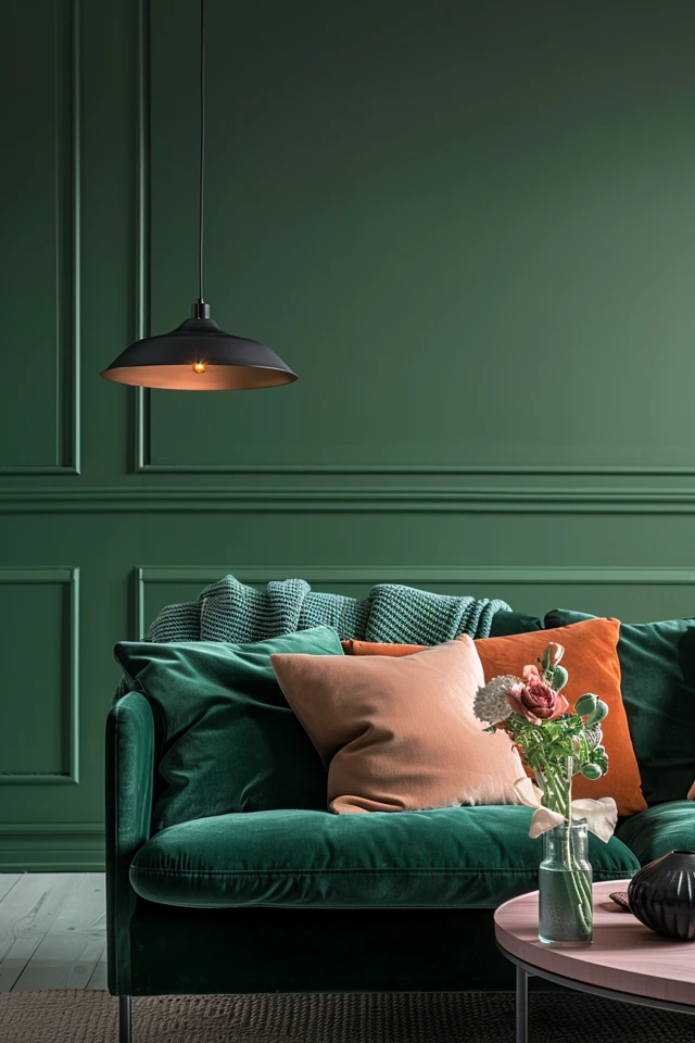
Choosing the right colors is key in interior design. It brings life to your home and ensures a seamless style flow. It’s important to look at the colors that are already there, like floors or tiles. These can either stand out or be subtly blended with other decor.
Digging into the colors of key furniture can be a smart move. Platforms like Pinterest are great for finding what you like. You can post pictures and spot common colors and patterns. Keeping your color picks to three to five shades can add depth and harmony to your space.
There are great online tools for picking colors, like Coolors, Pantone, Canva, and Color Hunt. They help mix warm and cool shades well. Picking the main and accent colors brings your room to life. Seeing examples helps understand how versatile color choice can be, making decorating fun and exact.

Key Takeaways
- Choosing the right color palette is fundamental to setting the desired ambiance and continuity in your home’s design.
- Consider existing, hard-to-change elements such as tiling or hardwood floors as statement pieces or camouflaged features.
- Use digital platforms like Pinterest to draw inspiration and identify preferred hues and patterns.
- Stick to a color scheme of three to five colors for depth and cohesion.
- Utilize online tools such as Coolors, Pantone, Canva, and Color Hunt for effective palette selection.
- Balance warm and cool tones to create visual harmony in decor.
- Select key and accent colors to ensure vibrancy and consistency throughout the space.
Understanding the Basics of Color Theory
Understanding the basics of color theory is key for making interiors that look good and feel right. It all starts with the primary colors – red, yellow, and blue. These colors are special because you cannot make them by mixing other colors.
Instead, they are the starting point for all other colors. Knowing how these colors work together is crucial.
Primary, Secondary, and Tertiary Colors
Once you understand primary colors, you’ll see how secondary colors come into play. Secondary colors are green, orange, and purple. They are created by mixing two primary colors together.
This adds variety to your color palette. It also helps make color schemes that are pleasing to the eye. Then, adding a primary color to a secondary color gives us tertiary colors.
Examples include red-orange and blue-green. These colors allow for even more detailed and interesting color combinations in design.

Color Harmonies and the Color Wheel
The color wheel is an essential tool for understanding color harmony. It shows how colors relate to each other. For example:
- Analogous schemes: Use colors next to each other on the color wheel for a unified look.
- Monochromatic schemes: Use different shades of the same color to create calmness.
- Complementary schemes: Combine colors from opposite sides of the wheel for a lively contrast.
Knowing these color harmonies can make any space welcoming and interesting. The trick is to grasp how colors interact. Then use them to make spaces that are visually captivating.
Using Online Tools for Color Selection
The digital era has made choosing colors for your home easier than ever. Thanks to modern tools like color generators and digital palettes, creating the perfect look is simple. You can design a color scheme online without any hassle.
Popular Online Color Generators
Today, you can find amazing color visualizers like Sherwin-Williams, Glidden Paints, and Coolors. Sites like Canva and Colormind let you customize color palettes just how you want them. Plus, on COLOURlovers, you get heaps of inspiration from designs created by others. These tools help you experiment with colors until you find just the right mix for your house.
Utilizing Paint Brand Tools
Paint brands like Benjamin Moore and Adobe Color have great apps for choosing colors. They show you exact paint colors from their range, making it easy to see how your choices will look. Tools like DaGraeve are awesome for pulling colors from any photo, which really helps in designing. However, it’s always good to test paint in your space first, since lighting can change how colors look. This ensures the color you pick is the one you’ll love.
Integrating Personal Style in Online Interior Design
To design a space that shows who you are, adding personal style is key. Online design techniques make it easy to mix your tastes with popular styles. This provides an ambiance that is both attractive and welcoming.
Creating Cohesive Spaces
A cohesive interior design means everything in the space looks good together. This is done by choosing a clear theme with consistent colors, patterns, and materials. Using neutral colors as a base allows brighter items to stand out while keeping the room balanced.
Balancing Bold and Neutral Colors
Finding the right mix of bold and neutral colors is crucial in design personalization. Bold colors add life and personality to a room. Neutrals provide a calming background, making the space feel grounded.
Online design tools help you use these ideas easily. They let you create spaces that are not just pretty but also reflect you. Whether you’re into bright, lively looks or calm, minimalist vibes, knowing how to use bold and neutral colors is important.

Conclusion
Exploring online interior design highlights how important colors are. We start by learning color theory basics. This helps us create rooms that feel just right. Knowing how primary, secondary, and tertiary colors work together lets us make smart choices. The color wheel helps us find colors that look good together.
We can also use cool digital tools to pick colors. Tools like Coolors and apps from paint companies like Sherwin-Williams and Benjamin Moore are super handy. They make it easy to put together the perfect color palette for any room. These tools help us make sure the colors in a space work well together.
In the end, the best thing about online interior design is mixing expert advice with what you love. Digital tools bring our vision to life, creating a place that feels both stylish and personal. By choosing colors carefully, we can make a space that truly feels like ours. This shows how powerful good color choices are in online interior styling.
FAQ
How can I choose the perfect color palette for my interior design?
Why is understanding color theory essential for interior design?
Knowing about primary, secondary, and tertiary colors helps. The color wheel shows how colors work together. This lets you make spaces that feel good and look right.
What online tools can help me with color selection for my interior design?
Try tools like Sherwin-Williams, Glidden Paints, and Coolors for unique color ideas. Apps from brands like Benjamin Moore and Adobe Color offer specific colors. This makes choosing easier.
How should I integrate personal style into my online interior design?
Keep a consistent theme with color, patterns, or materials. Mix bright colors and neutrals for balance. This adds personality but keeps it calm.
Use online tools and color theory to add your own touch smoothly.
Can digital tools replace physical color testing?
Digital tools are helpful at first. But real-life testing in your space is key. Lights change how colors look. Testing makes sure you get the feel you want.
What are some examples of color harmonies that work well in interior design?
Good choices are analogous schemes, using colors close on the wheel. Or try a monochromatic look with one color. Complementary colors, facing each other on the wheel, also work. These combos make your design pop.