
Tile Backsplash Ideas for Dark Cabinets & Light Counters
Designing a kitchen with dark cabinets and light countertops creates a stunning, high-contrast foundation. This “tuxedo” style or moody aesthetic is timeless, but it leaves one massive design question unanswered: what happens in the middle? The backsplash is the bridge that connects your grounding cabinetry to your airy work surfaces.
When clients come to me with navy, charcoal, or forest green cabinetry paired with marble or quartz, they often feel stuck. They worry that a white backsplash will look too boring, but a dark backsplash might make the room feel like a cave. The truth is, this high-contrast pairing actually gives you more freedom than a standard all-white kitchen.
In this guide, I will walk you through the design principles, material choices, and installation tips I use on real job sites to nail this look. For a massive dose of visual inspiration, keep in mind that a curated Picture Gallery is available at the end of this blog post. Let’s get your kitchen finished.
Understanding Contrast and Undertones
Before you buy a single sample, you have to understand the color science happening in your kitchen. Dark cabinets are heavy; light counters are airy. Your backsplash choice dictates the balance.
If you choose a light backsplash that matches the counters, you visually extend the countertop up the wall. This makes the room feel taller and brighter. It is the safest and most classic route.
If you choose a dark backsplash that matches the cabinets, you lower the visual center of gravity. This creates a cozy, intimate, and very moody vibe. This is often better for larger kitchens that can handle the visual weight.
The Undertone Trap
The biggest mistake I see DIYers make is mixing warm and cool tones unintentionally.
- Cool Combinations: If your dark cabinets are a true black or a cool blue-grey, and your counter is a stark white quartz, your backsplash should likely be a cool white or a cool grey.
- Warm Combinations: If your cabinets are a warm espresso or a green with yellow undertones, and your counters are a creamy marble, a stark bright white tile will look blue and cheap. You need a creamy off-white or handmade zellige tile.
Designer’s Note: The Vertical Test
Never test a tile sample by laying it flat on the counter. Light hits vertical surfaces differently than horizontal ones. Prop the tile up against the wall under your upper cabinets. Check it at 10:00 AM, 2:00 PM, and 8:00 PM with the lights on. The shadow cast by the upper cabinets can change a light grey tile to a dark charcoal instantly.
The Classic Bridge: White and Neutral Tiles
Using a light tile is the most functional choice for a kitchen with dark cabinets. It reflects under-cabinet lighting onto your work surface, making prep work easier. However, “white tile” does not have to mean boring subway tile.
Handmade Zellige and Glazed Finishes
To prevent the kitchen from looking sterile, I almost always recommend a tile with variation. Zellige tiles (or zellige-look ceramic) have undulating surfaces and imperfect edges.
When light hits these tiles, it shimmers and bounces. This texture adds warmth to the stark contrast of dark cabinets. It softens the transition between a smooth quartz counter and a painted cabinet door.
Marble Mosaics
If you have solid-colored light quartz counters, a marble mosaic backsplash is a great way to introduce pattern. The grey or gold veining in the marble picks up the drama of the dark cabinets, while the white background ties into the counters.
Spacing Logic:
- If your counter has heavy veining (like Calacatta Gold), keep the backsplash simple.
- If your counter is solid white or quiet, you can go wild with a backsplash pattern.
Common Mistakes + Fixes
Mistake: Using a bright white grout with white subway tile in a kitchen with dark cabinets.
Fix: The stark white grid can look too busy against the solid dark cabinets. I prefer a “warm grey” or “oyster” grout. It defines the tile shape without creating a jarring grid pattern.
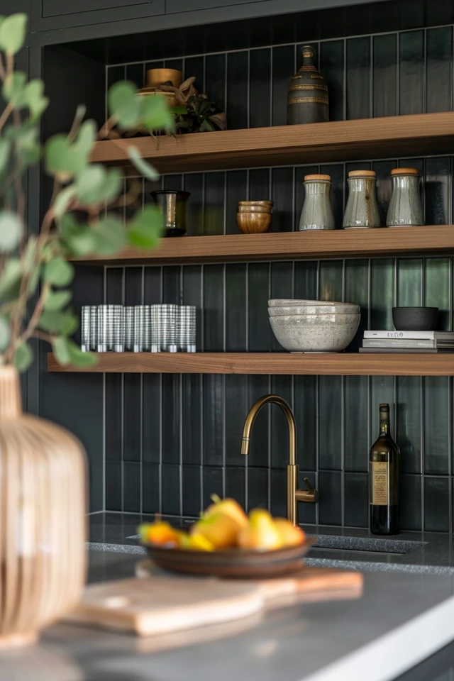
Embracing the Mood: Dark and Metallic Options
Sometimes we want to lean into the drama. Continuing dark tones up the wall creates a seamless, furniture-like appearance. This is popular in open-concept homes where the kitchen needs to recede visually.
Matte Black and Charcoal
A matte black hexagonal or picket tile looks incredibly sophisticated against light counters. The light counter creates a “stripe” of brightness that breaks up the wall of dark color.
If you go this route, under-cabinet lighting is mandatory. Without it, your workspace will be a black hole. I recommend 3000K (warm white) LED tape lights installed behind the front face frame of the upper cabinets.
Mirror and Metallic
For a touch of glam, antique mirror tiles or metallic-finish glass tiles are excellent. They reflect light, which solves the darkness issue, but they hold a dark tone.
This works exceptionally well in bar areas or butler’s pantries. It can feel a bit intense for a main perimeter backsplash, but it is a showstopper in smaller doses.
The “Slab” Splash
For the ultimate luxury look, run the countertop material up the wall. If you have a white counter with beautiful grey veins, seeing that vertical surface creates art.
This eliminates grout lines entirely, which is a dream for cleaning. However, you must account for the thickness of the material. Standard stone is 2cm or 3cm thick. You may need to adjust your faucet installation to ensure the handle doesn’t hit the stone backsplash.
Playing with Shape and Layout
Since you have a high-contrast color scheme, you don’t always need a loud color on the backsplash. Instead, use the shape of the tile to add interest.
Vertical Stacking
Instead of the traditional brick layout (running bond), stack rectangular tiles vertically. This draws the eye upward. In kitchens with dark cabinets, which can feel heavy, vertical lines help lift the ceiling.
Herringbone
A herringbone pattern adds a high-end, bespoke feel. It requires more cuts and more waste (buy 15-20% extra tile rather than the standard 10%), but the result is worth it.
Scale Rule of Thumb:
The standard distance between the countertop and the bottom of the upper cabinets is 18 inches.
- Avoid large format tiles (like 12×24) in this small space. They will look chopped up.
- Stick to mosaics or small-scale tiles (3×6, 2×8, or 4×4) to ensure you get full repetitions of the pattern within that 18-inch height.
The “Rug” Effect
If you have a large range hood area where the backsplash goes all the way to the ceiling, consider a “picture frame” feature. Use a different tile or a framed pattern behind the stove. This breaks up the dark cabinetry and creates a focal point.
Installation, Grout, and Practical Constraints
Design is 10% inspiration and 90% execution. Even the most beautiful tile will fail if the installation details are off.
Grout Selection is Critical
With dark cabinets, your eye is already adjusting to strong blocks of color. Do not let the grout become a distraction.
- Matching Grout: Matches the tile color. Makes the wall look like a texture rather than a pattern. Good for small kitchens.
- Contrasting Grout: Highlights the shape of the tile. Good for simple shapes like subway tile.
- Designer Tip: For dark tiles, use a high-performance grout (like epoxy or urethane) or a dark grey grout. Black grout can sometimes fade to charcoal over time, so starting with a high-quality charcoal is often safer.
Edging and Trim
How you end the backsplash is just as important as the tile itself. Since you have dark cabinets, you might have exposed cabinet sides.
Do not use cheap plastic edging. Use a metal Schluter strip that matches your cabinet hardware (brass, matte black, or nickel). Alternatively, pay extra for “bullnose” tiles which have a finished rounded edge.
Real-World Constraints: Outlets
Dark cabinets usually mean dark outlet covers if they are mounted on the cabinet. But on a light backsplash, a dark outlet is an eyesore.
The Fix: Coordinate your outlets to the surface they sit on.
- On the dark cabinet island: Black or bronze plates.
- On the light tile backsplash: White or matte grey plates.
- Ideally, install outlets horizontally near the bottom of the upper cabinets to hide them from the main sightline.
Final Checklist: What I’d Do in a Real Project
If I were managing your renovation today, here is the exact checklist I would run through before ordering materials.
1. Confirm Lighting Temperature
Ensure your kitchen LEDs are consistent (usually 3000K or 3500K). Test your tile samples under this specific light. 4000K+ (Daylight) can make dark cabinets look sterile and commercial.
2. The “Grease Zone” Test
Take a sample of the tile and smear a little cooking oil on it. Wipe it off. Does it stain? Unsealed natural stone or porous cement tiles are nightmares behind a stove. If you love the look, seal it three times before use.
3. Check the Dye Lot
If you are buying boxes of tile, check the “Lot Number” on the side of every box. They must match. Dark glazes are notoriously difficult to keep consistent. A “Navy Blue” from batch A can look purple compared to batch B.
4. Plan the Start Point
Determine where the tile starts. Center the pattern on the sink or the range. Do not start at the wall edge, or you might end up with slivers of tile at the focal points.
5. Measure the Thickness
If your dark cabinets have light rail molding at the bottom, ensure the tile fits behind it. If the tile is too thick, you may need to shim the molding or remove it entirely.
FAQs
Q: Can I use peel-and-stick tile for a rental with dark cabinets?
Yes, but be careful with the adhesive. Dark cabinets absorb heat, and if the backsplash is near a stove, cheap adhesive can fail. Look for “heat-resistant” vinyl tiles. A white subway peel-and-stick with grey “grout” is the most convincing option for rentals.
Q: Should the backsplash match the floor or the counters?
Generally, it should relate to the counters. The floor is a separate plane. If you have dark wood floors and dark cabinets, a light backsplash and counter are essential to prevent the room from feeling heavy.
Q: How high should the backsplash go?
Standard is 18 inches (to the bottom of the cabinet). However, if you have a window over the sink, take the tile all the way to the ceiling around the window. It makes the window feel bigger and the room more custom.
Q: Is glass tile out of style?
Thin, linear mosaic glass tile (the “barcode” look) is dated. However, larger format glass tiles (3×12) or poured glass with a wavy texture are very current and work well to reflect light in dark kitchens.
Q: My dark cabinets are painted wood. How do I protect them during tiling?
Use low-tack painter’s tape (the purple or delicate surface yellow kind) to mask off the edges of the cabinetry where they meet the wall. Grout haze can get into the grain of painted wood and is very hard to remove without scrubbing the paint off.
Conclusion
Pairing dark cabinets with light counters is a bold design move that pays off with a sophisticated, timeless kitchen. The backsplash is your opportunity to either soften that contrast or highlight it.
Whether you choose a reflective zellige to bounce light around the room or a moody matte black to deepen the aesthetic, the key is attention to undertones and lighting. Remember to test your samples vertically, plan your layout around the focal points, and don’t skimp on the under-cabinet lighting.
With the right texture and scale, your backsplash will stop feeling like a “middle child” and start acting as the cohesive element that ties your beautiful tuxedo kitchen together.
Picture Gallery


