
Trendy Kitchen Floor Tile Ideas 2024 Guide
Introduction
Choosing the right floor for your kitchen is often the most high-stakes decision in a renovation. Unlike paint, which can be swapped in an afternoon, or backsplash tile, which covers a small area, your floor is the foundation of the entire room’s palette. It has to withstand dropped pots, muddy paw prints, and constant foot traffic while still looking effortless. In my years of designing kitchens, I have seen clients treat flooring as an afterthought, only to realize that the wrong tone throws off their expensive cabinetry.
The trends for 2024 are shifting away from the stark, sterile gray planks that dominated the last decade. We are seeing a massive return to warmth, texture, and organic variation. Homeowners are craving spaces that feel lived-in and grounded, rather than showroom-perfect. This means natural stone, warm terracotta, and patterns that add character are taking center stage.
However, navigating these trends requires a balance of aesthetics and practicality. You need to know which materials will actually hold up to your specific lifestyle. For a full visual walkthrough of these styles, I have curated a specific Picture Gallery at the end of the blog post. Let’s dive into the materials and layouts that will define kitchen design this year.
1. The Rise of “Quiet Luxury”: Large Format Porcelain
One of the strongest trends this year is the move toward large-format tiles. We are moving away from the standard 12×12 or 12×24 inch tiles. The new standard for a modern, high-end look is 24×48 or even 30×30 inches. The goal here is to minimize visual clutter.
When you use larger tiles, you significantly reduce the number of grout lines on your floor. This creates a seamless, monolithic appearance that tricks the eye into thinking the kitchen is much larger than it is. It mimics the look of slab stone or poured concrete without the astronomical price tag.
The Material Matters
In 2024, matte porcelain that mimics natural limestone or travertine is the top choice. Unlike real stone, porcelain is non-porous and incredibly durable. You get the soft, organic visual of limestone without worrying about etching every time you spill lemon juice or vinegar.
Designer’s Note: The Subfloor Requirement
Here is the lesson I learned the hard way on a project in a historic home: Large tiles are unforgiving. If your subfloor has any humps or dips, large tiles will crack or create “lippage,” where one edge of the tile sticks up higher than its neighbor.
- The Rule: For tiles larger than 15 inches on any side, the subfloor flatness variance cannot exceed 1/8 inch over 10 feet.
- The Fix: You must budget for self-leveling underlayment. Do not let your contractor skip this step.
Common Mistakes + Fixes
- Mistake: Using a polished finish in a kitchen.
- Correction: Kitchens are wet zones. Polished tile becomes an ice rink when wet. Always check the DCOF (Dynamic Coefficient of Friction) rating. You want a rating of 0.42 or higher for safety.
- Mistake: Choosing a contrasting grout.
- Correction: For this look, match the grout color exactly to the main tone of the tile. You want the lines to disappear, not frame the tile.
2. The Checkerboard Revival: Classic with a Twist
Checkerboard floors are timeless, but the 2024 iteration is softer and more organic than the stark black-and-white diners of the 1950s. We are seeing a shift toward “tone-on-tone” checking. Think soft sage green paired with creamy white, or warm beige paired with a darker taupe.
This trend works beautifully in both small galley kitchens and expansive open floor plans. It adds instant architectural interest and roots the kitchen in a sense of history. It creates a focal point on the floor, allowing you to keep the cabinetry and walls relatively simple.
Scaling Your Checks
The size of the square dictates the vibe of the room. A common error DIYers make is choosing a tile size that is too small for the room, creating a dizzying, busy effect.
- Small Kitchens: Surprisingly, a larger check (16×16 or 18×18) often makes a small room feel bigger.
- Large Kitchens: You can go up to 24×24 inches for a grand, estate-like feel.
- The Layout: Laying the pattern on a diagonal (bias) draws the eye outward to the corners of the room, visually widening narrow spaces.
Material Combinations
While ceramic is standard, mixing natural stones is the “it” look for 2024.
- Marble Mix: Pairing Carrera marble (white/grey) with Bardiglio (grey/blue) creates a sophisticated, low-contrast look.
- Texture Play: Use tumbled stone rather than honed or polished. Tumbled edges give it that “been here for 100 years” European farmhouse aesthetic.
Pro-Tip: The Border
In high-end design, we rarely let the checkerboard pattern hit the wall abruptly. We usually design a “border” using the solid darker color from the pattern. This frames the room like a rug. If your kitchen has an island, ensure the pattern is centered on the main cooking aisle, not necessarily the geometric center of the room.
3. Organic Warmth: Terracotta and Earth Tones
Biophilic design—bringing the outdoors in—is heavily influencing flooring. We are seeing a massive resurgence of terracotta, but not the shiny, orange Mexican paver tiles of the 90s. The 2024 terracotta is matte, dusty, and leans toward pinks, peaches, and deep browns.
This material adds instant warmth to a white or gray kitchen. It pairs exceptionally well with the trending green and blue cabinet colors. Shapes are also evolving beyond the square; hexes, pickets, and arabesque shapes in terracotta are very popular.
The Reality of Real Clay
If you fall in love with authentic terracotta, you need to know what you are signing up for. It is extremely porous.
- Sealing: You must seal these tiles before grouting (to prevent grout haze) and again after grouting. They will need resealing every 2-3 years.
- Patina: They will chip and stain. For many clients, this “living finish” is part of the charm. If you are Type A and want perfection, this is not the floor for you.
The Porcelain Alternative
If you have kids, pets, or a rental property, look for “terracotta-look” porcelain. Technology has gotten so good that these tiles now feature high variation and texture that mimics hand-made clay.
- Why choose lookalikes: Zero maintenance, no sealing required, and they are impervious to dog claws and dropped spaghetti sauce.
- Styling Tip: Use a slightly wider grout joint (3/8 inch) with a sandy, warm gray grout to mimic the traditional installation method.
Designer’s Note: Color Coordination
Terracotta is a bossy material. It has strong undertones. If you choose this floor, avoid cool-toned gray cabinets. Instead, opt for creamy whites (like Swiss Coffee), warm greige, or natural wood cabinetry to harmonize with the floor’s warmth.
4. Wood-Look Porcelain: The Herringbone Installation
Wood flooring in kitchens is popular for open-concept homes, but real wood and water are enemies. A dishwasher leak can ruin a hardwood floor in hours. That is why wood-look porcelain tile remains a staple, but the 2024 update is all about the installation pattern.
We are seeing a move away from the standard “staggered” layout. The trend is Herringbone or Chevron layouts. This elevates the humble wood-look tile into something that feels custom and expensive.
Choosing the Right Plank
The biggest giveaway of a fake wood floor is a short plank. Real wood planks are long.
- Size Rule: Look for tiles that are at least 36 to 48 inches long. Anything shorter looks like a patchwork quilt.
- Rectified Edges: Ensure the tile has “rectified” edges (cut straight up and down) rather than “pressed” edges (rounded). This allows for a super tight grout line (1/16 inch), which is essential for fooling the eye.
The Grout Secret
I cannot stress this enough: The grout color makes or breaks this look.
- The Trick: Do not match the lightest tone in the wood. Match the darkest grain tone.
- Why: Darker grout recedes and looks like a shadow between boards. Light grout frames the tile and screams “this is tile!”
Waste Calculation
If you decide on a herringbone pattern, you must order more material. Standard layouts require 10% overage for cuts and waste. Herringbone requires 15% to 20% overage because of the angled cuts required at every wall perimeter.
5. Natural Stone Textures: Limestone and Slate
For the ultimate tactile experience, natural stone is dominating luxury kitchens. Specifically, honed limestone and slate. These materials offer a grip that is safer for kitchens and a visual depth that manufactured products still struggle to copy perfectly.
Slate is making a comeback, specifically in large rectangular formats (12×24) rather than the small multicolored squares of the past. Black or charcoal slate provides a grounding contrast to light cabinetry and is virtually indestructible.
Limestone Logistics
Limestone is softer than granite or marble. It feels amazing underfoot—almost velvety—but it requires care.
- Acid Sensitivity: Limestone is calcium-based. Vinegar, wine, and fruit juice can etch the surface.
- The Fix: Always choose a “honed” finish rather than polished. A honed finish is matte and already has a texture, so minor etching blends in rather than standing out as a dull spot on a shiny floor.
What I’d Do in a Real Project
If a client wants the look of limestone but has three dogs and a busy kitchen, I specify a “struttura” finish porcelain. This is a textured surface that mimics the grip and feel of stone. We recently used a Belgian Bluestone-look porcelain in a mudroom/kitchen combo. It hides dirt incredibly well and hoses down effortlessly.
Final Checklist: Before You Buy
Don’t purchase 500 square feet of tile based on an Instagram photo. Here is the checklist I use for every project to ensure the floor works in reality, not just in concept.
1. The Scratch Test
Order a sample. Take a fork and try to scratch it. Take a heavy pot and drop it on the sample from counter height (do this outside!). If the glaze chips off to reveal a different color clay body underneath, do not buy it. You want “through-body” porcelain where the color goes all the way through.
2. The Wet Test
Pour a cup of water on the sample tile. Put your shoe on it. Try to slide. If it feels slippery, imagine walking on it while holding a pot of boiling pasta. If there is no grip, it is a no-go for the kitchen.
3. Lighting Check
Place the sample on the floor in your kitchen. Look at it in the morning light, noon sun, and evening artificial light. Dark floors can suck the light out of a room; light floors can show every spec of dust.
4. Grout Selection
Never pick grout from a color card. Buy the small powder sample bags, mix them up with water, and let them dry on your sample tile. Grout usually dries lighter than it looks when wet.
5. Transition Planning
Measure the thickness of the tile plus 1/2 inch for mortar. Compare this to the height of your adjoining floors (living room wood or hallway carpet). You need to buy the correct transition strips (Schluter strips or wood thresholds) to prevent toe-stubbing hazards.
FAQs
Is tile flooring too cold for a kitchen?
Tile is naturally cool, which is great in summer but tough in winter. The best solution is installing an electric radiant heat mat underneath the tile. It is surprisingly affordable if you do it during installation. If that isn’t in the budget, prioritize rugs in prep zones (sink and stove) to keep your feet off the cold surface.
Can I install new tile over my old tile?
Technically, yes, if the old tile is perfectly adhered and level. However, I rarely recommend it. It raises the floor height significantly, which can trap your dishwasher (making it impossible to pull out for repairs) and creates trip hazards at doorways. It is always better to demo down to the subfloor.
What is the most durable tile for dogs?
Through-body porcelain with a PEI (Porcelain Enamel Institute) rating of 4 or 5 is the gold standard. It is harder than granite. Avoid natural softer stones like marble or limestone if you have large dogs, as their claws can scratch the surface over time.
Should floor tile go under the cabinets?
Yes. Always install the floor wall-to-wall before installing cabinets if possible. If you ever decide to change the cabinet layout in the future, you won’t be left with gaps in the flooring. It also protects the subfloor from leaks that might happen under the sink.
How do I make a small kitchen look bigger with tile?
Use larger tiles (minimum 12×24) and lay them parallel to the longest wall in the room. Match the grout color to the tile to reduce visual noise. Avoid busy, small patterns which can make the floor feel cluttered.
Conclusion
The kitchen floor is the workhorse of your home. The trends for 2024—from large format quiet luxury to the warmth of terracotta—prove that you don’t have to sacrifice style for durability. The key is honesty about your lifestyle. If you love to cook messy meals, skip the porous natural stone and embrace the high-tech porcelain alternatives.
Take your time with the layout. A simple tile can look extraordinary with a herringbone pattern or a thoughtful border. Remember to order samples, test them rigorously, and always prioritize proper subfloor preparation. Your future self will thank you when your floor looks just as good in ten years as it does today.
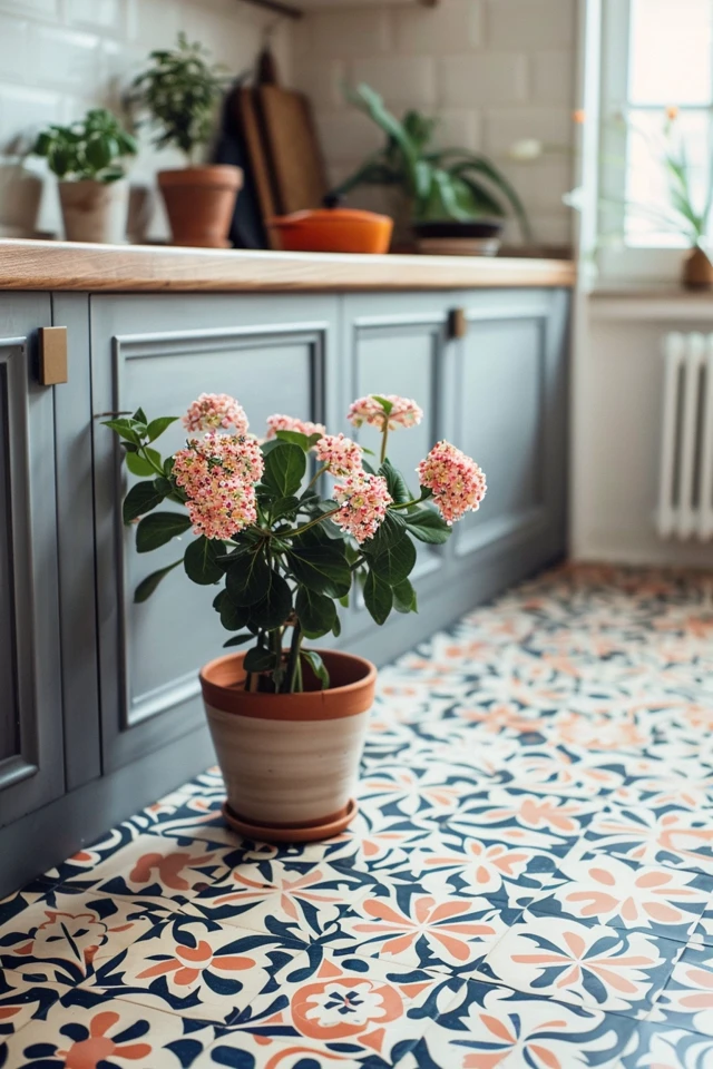
Picture Gallery


