
Title: Vibrant Rainbow Party Ideas for Adults Fun
Introduction
When most people hear “rainbow theme,” their minds immediately drift to children’s birthday parties, plastic streamers, and overly saturated primary colors. However, as an interior designer, I see the color spectrum as a sophisticated tool for creating mood, energy, and flow within a space. Hosting an adult gathering centered around a vibrant spectrum requires a shift in perspective—moving away from chaotic confetti and toward curated color blocking, thoughtful lighting, and textural depth.
My goal is to show you how to execute a multi-colored event that feels architectural and expensive rather than temporary and cheap. Get ready for some serious inspiration because I have curated an exclusive Picture Gallery at the end of this blog post to spark your creativity. By applying fundamental design principles like scale, balance, and negative space, you can transform your home into a prismatic experience that feels chic and intentional.
We will cover everything from zoning your floor plan by hue to selecting the right glassware that catches light just right. Whether you are working with a sprawling backyard landscape or a cozy rental apartment, these design-forward strategies will ensure your party feels cohesive. Let’s look at how to bring the rainbow home in a way that feels grown-up and stylish.
1. Sophisticated Color Blocking and Zoning
The biggest mistake people make with rainbow themes is mixing every color in every square foot of the room. This creates visual noise and anxiety. The designer approach is “zoning.” Instead of a scramble of colors, dedicate specific areas of your layout to specific monochromatic moments that transition into the next.
For example, your entry console might feature warm reds and oranges, transitioning into yellow and green florals on the dining table, and cooling down to blues and purples in the lounge area. This guides guests through the space naturally. It creates an ombré effect across the physical footprint of your home.
If you are in a small apartment or open-concept living room, use textiles to anchor these zones. A citron velvet chair paired with a navy throw pillow creates a high-contrast block that feels deliberate. Avoid small, cluttery decor items. In design, we prefer fewer, larger statements. A single, massive oversized vase with blue hydrangeas is far more effective than twenty small blue party favors scattered around.
Designer’s Note: The 60-30-10 Rule
Even in a rainbow theme, you need balance. Do not give every color equal weight. Pick a dominant color for 60% of the room (perhaps a neutral base or a soft wash of blue), a secondary color for 30% (like a deep emerald green), and use the bright “rainbow” accents for the final 10%. This keeps the eye from becoming overwhelmed.
Common Mistakes + Fixes
- Mistake: Using cheap plastic tablecloths to get the color.
- Fix: Use fabric runners or yardage from a fabric store. Linen, cotton, or even raw silk adds texture that plastic cannot replicate. If you are on a budget, buy painter’s drop cloth and dye it yourself for a custom, muted rainbow look.
2. The Art of the Tablescape: Glass, Light, and Height
Your dining or buffet table is usually the centerpiece of the event. To keep it adult-appropriate, focus on transparency and material quality rather than opaque plastics. Colored glassware is one of the most elegant ways to introduce the rainbow theme. When light hits colored glass—whether it is amber, amethyst, or teal—it casts jewel-toned shadows on the table, doubling the visual impact without adding physical clutter.
Layering is critical here. Start with a neutral tablecloth (crisp white or moody charcoal) to let the colors pop. Then, arrange your floral centerpieces in a gradient. You can arrange flowers from red to violet down the length of the table. Ensure your centerpieces adhere to the “talk-over” rule: they should be either shorter than 12 inches or taller than 24 inches so guests can see each other across the table.
Don’t forget the chargers and napkins. If you have neutral plates, use a spectrum of linen napkins. You can buy a set of white cotton napkins and dip-dye them in varying saturation levels of the same hue, or do a full spectrum. The key is uniformity in the fold and placement—repetition creates rhythm.
Realistic Constraints: Renters and Small Tables
If you have a small round table (36-48 inches), you don’t have space for a long linear gradient. Instead, choose a “triadic” color scheme. Pick three colors equidistant on the color wheel (like violet, orange, and green) and group your styling items in these clusters. It reads as colorful and vibrant but remains geometrically balanced.
What I’d Do in a Real Project
- Base: Charcoal linen runner (hides stains, makes colors pop).
- Lighting: Taper candles in varying shades (blush, terracotta, mustard).
- Glassware: Mix-and-match vintage colored goblets.
- Florals: Monochromatic bunches in low vases. One vase all pink roses, the next all orange ranunculus.
3. Lighting Design to Saturate the Space
Lighting is the unsung hero of interior design, especially for evening events. You cannot rely on your standard overhead recessed cans for a party; they flatten features and wash out colors. For a vibrant theme, you want lighting that enhances the pigment of your decor.
Swap out standard bulbs in your floor and table lamps for smart bulbs (like Philips Hue or similar). This allows you to wash a white wall in a deep indigo or a soft magenta. The beauty of colored light is that it acts as paint without the commitment. In a rental, this is the single most effective way to change the entire atmosphere of a room instantly.
If you have an outdoor space, landscape lighting is crucial. Avoid the multicolored “Christmas” string lights. Instead, use warm white bistro lights (2700K temperature) overhead, and use uplights on specific trees or shrubs with colored gels. Uplighting a large tree canopy in green or purple adds dramatic verticality and expands the visual boundary of the party.
Measurements and Placement
- Lamp Height: Ensure table lamps are at eye level when seated (approx. 58-64 inches from the floor) to create flattering glows.
- Bistro Lights: String them at least 8 feet high at the lowest point so tall guests feel comfortable.
- Uplighting: Place fixtures 12-18 inches from the base of the wall or tree you are highlighting to get the best “grazing” effect on the texture.
Common Mistakes + Fixes
- Mistake: Using “Cool White” or “Daylight” bulbs (5000K+) which make interiors look clinical and hospital-like.
- Fix: Stick to 2700K or 3000K for white light, or go fully saturated with colored smart bulbs. Dimmers are non-negotiable—keep light levels at 60-70% for ambiance.
4. Furniture Layout and Flow
The way you arrange furniture dictates how people socialize. For a vibrant party, you want energy to flow, which means avoiding dead ends. Pull furniture away from the walls. Floating your sofa even 3 or 4 inches off the wall creates a sense of spaciousness and luxury.
Create conversation circles. A standard sofa fits three people, but it’s awkward for conversation if they are all in a row. Place two accent chairs opposite the sofa. The ideal distance between a sofa and a coffee table is 14 to 18 inches—close enough to set down a drink, far enough to walk through sideways if necessary.
For the rainbow theme, you can use throw pillows or slipcovers to designate these seating groups. Perhaps the outdoor patio furniture is dressed in cool blues and greens (relaxing), while the indoor bar area features high-top tables with warmer red and orange accents (energetic). This subconscious color psychology influences guest behavior; they will likely be louder and more active near the red/orange zones and calmer in the blue/green zones.
Traffic Lanes
As a designer, I always verify walkways. You need a minimum of 30 to 36 inches of clearance for major traffic paths. If you are bringing in extra rental chairs or tables, measure this out with blue painter’s tape on the floor beforehand. If guests have to squeeze sideways to get to the bathroom, the layout has failed.
Designer’s Note: The Rug Trick
If you have a neutral area rug, layer a smaller, colorful vintage or kilim rug on top. It adds instant color and pattern without requiring you to replace the main rug. Ensure the top rug sits entirely on the bottom rug with at least 6-12 inches of border showing.
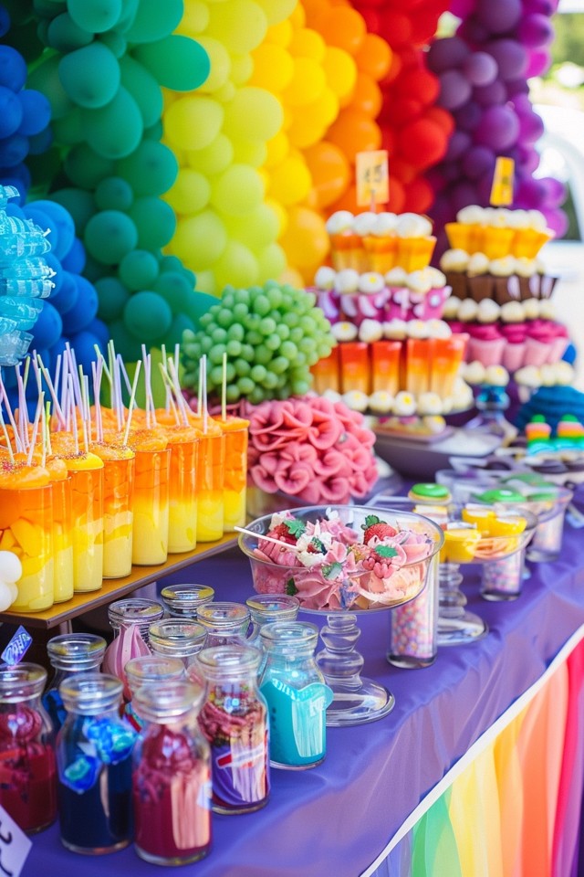
5. Styling the Food and Bar Station
The food and drink station is a major focal point and a prime opportunity for design. Instead of laying everything flat on the counter, you need elevation. In landscape design, we use terraces to create interest; do the same on your table.
Use risers to create different heights. You can use clear acrylic blocks for a modern look or wooden crates for a rustic vibe. Arrange the food by color. A charcuterie board is naturally beautiful, but a color-blocked grazing table is a showstopper. Group red fruits and meats, transition to orange cheeses and crackers, then to green grapes and olives.
For the bar, the “Rainbow Cocktail” menu is a fun concept, but execution matters. Pre-batching cocktails in glass dispensers is cleaner and more aesthetically pleasing than a clutter of liquor bottles. Garnish is where the design happens here—use dehydrated fruit wheels, edible flowers, or colored rim salts.
Durability and Surfaces
If you are serving red wine or brightly colored punches, protect your surfaces. Porous stones like marble will stain instantly with cranberry or pomegranate juice.
- Protection: Use large trays to contain spills. A mirrored tray reflects the glassware and adds sparkle.
- Coasters: scatter twice as many coasters as you have guests.
What I’d Do in a Real Project
- Backdrop: I would hang a large-scale piece of abstract art or a temporary wallpaper panel behind the bar to frame the station.
- Vessels: I would use white ceramic platters. White provides the best contrast for colorful food, making the natural pigments of the ingredients pop.
- Tags: Use uniform cardstock for food labels. Handwriting matters—or use a simple, clean font.
Final Checklist
Before your guests arrive, run through this designer-approved checklist to ensure your space is functional and beautiful.
- Walk the Path: Walk from the entrance to the food, then to the bathroom. Are there tripping hazards? Is the path 36 inches wide?
- Light Check: Dim the overheads. Turn on the lamps. Does everyone look good? If there are dark corners, add a floor uplight or a candle.
- Temperature: If you have a lot of people, the room will heat up. Set the thermostat 2-3 degrees lower than normal an hour before the party.
- Scent: A subtle scent adds a layer of design. For a rainbow party, citrus or fresh floral scents work best. Avoid heavy vanilla or spice.
- Bathroom: It’s a small room, but it needs design love. fresh towels, a small vase with a single colorful flower, and a good soap dispenser.
FAQs
How can I do a rainbow theme on a strict budget?
Focus on consumables. Fruit, vegetables, and flowers are the cheapest way to add massive amounts of color. A bowl of lemons, a bowl of limes, and a bowl of red apples create a high-impact design moment for under $15. Use paper napkins in solid bright colors instead of buying expensive linens.
How do I make the party feel cohesive if my furniture is mismatched?
Color is the great unifier. If your chairs don’t match, try to tie them together with identical seat cushions or by draping a uniform color throw over the backs. Distract the eye by drawing attention upward with lighting or tall floral arrangements.
Is it okay to mix pastels with neon brights?
Generally, no. As a rule of thumb, stick to similar saturation levels. If you are doing pastels, keep everything muted (mint, blush, lavender). If you are doing brights, keep everything punchy (cherry red, lime green, electric blue). Mixing muddy tones with electric tones usually looks accidental rather than designed.
What if I have dark walls? Will the rainbow theme work?
Absolutely. Dark walls (navy, charcoal, black) are actually the best backdrop for bright colors because they create high contrast. Jewel tones look exceptionally luxurious against dark paint. Focus on lighting to ensure the colors pop against the moody background.
Conclusion
Hosting a vibrant rainbow party for adults is about exercising restraint just as much as it is about celebrating color. By zoning your space, layering high-quality textures, and using lighting to paint the room, you elevate the concept from a children’s theme to a high-end design experience.
Remember that your home is the canvas. You don’t need to repaint walls or buy new furniture to change the mood. Smart application of textiles, florals, and light can completely alter the architecture of a room for an evening. Trust your eye, stick to the rules of scale and flow, and don’t be afraid to let the color speak for itself.
Picture Gallery


