
Warm Brown and Cream Bathroom Inspirations
For years, the interior design world was dominated by stark white subway tiles and cool gray vanities. While clean, those spaces often felt clinical and lacked the restorative energy we actually crave in a bathroom.
Recently, I have seen a massive shift toward “latte” tones, organic warmth, and spa-like serenity. Combining warm browns—from deep walnut to soft terracotta—with rich creams creates a palette that feels grounded and luxurious.
This color story works in powder rooms, master baths, and even kid-friendly spaces because it hides grime better than white and feels cozier than gray. For a massive dose of visual inspiration, scroll down to the Picture Gallery at the end of this post.
1. Establishing the Palette with Tile and Stone
The most impactful way to introduce this color scheme is through your hard surfaces. In a warm brown and cream bathroom, you want to avoid stark white porcelain, which will look too harsh against organic wood tones.
Travertine and Limestone
Natural stone is the gold standard for this aesthetic. Silver Travertine (which is actually a mix of warm greige and brown) or classic beige Travertine provides instant texture.
If you choose Travertine for floors, opt for a honed and filled finish. This ensures the natural pits in the stone are filled with epoxy, making the floor easy to mop and comfortable for bare feet.
Ceramic Alternatives
If natural stone is out of budget or you worry about maintenance, look for “Zellige-style” ceramic tiles in colors like “sand,” “oatmeal,” or “wheat.”
These tiles have undulating surfaces that catch the light, mimicking the variation found in nature.
Designer’s Note: The Grout Rule
A common mistake I see is pairing warm cream tile with bright white grout. This creates a jarring grid that ruins the soft aesthetic.
Always match your grout to the darkest tone in your tile or go one shade darker. For cream tiles, use colors like “Alabaster,” “Biscuit,” or “Warm Gray.” This softens the transition and makes the room feel larger.
2. Selecting the Right Wood Tones for Vanity and Storage
Brown is the grounding element in this palette, and it usually comes from wood cabinetry. The specific species and stain you choose will dictate the mood of the room.
Walnut for Depth
Walnut is my go-to for a sophisticated, mid-century, or modern look. It has a natural richness that pairs beautifully with creamy marble countertops.
Because walnut is darker, it anchors the room. If you have a small bathroom (under 40 square feet), ensure you have excellent lighting, or the dark wood might absorb too much visual space.
White Oak for Spa Vibes
For a lighter, “Scandi-spa” feel, go with White Oak. However, avoid raw or clear-sealed oak if it leans too yellow.
Look for oak that has been stained with a “neutral” or “fumed” finish to knock out the yellow undertones, leaving you with a pleasant, sandy brown.
Maintenance for Wood in Bathrooms
Real World Lesson: I once had a client insist on a vintage teak sideboard converted into a vanity. Within six months, water splashes near the faucet caused the finish to lift.
If you use real wood, ensure it is sealed with a marine-grade varnish or a high-quality polyurethane.
For high-traffic kids’ bathrooms, I actually recommend high-quality thermofoil or laminate wood-look vanities. They have come a long way visually and are impervious to standing water.
3. Wall Treatments: Paint, Plaster, and Wallpaper
In a brown and cream scheme, your walls provide the “envelope” that holds everything together. Painting a bathroom stark white will make your warm wood vanity look out of place.
The Power of Limewash
Limewash paint is ideal for this aesthetic. It creates a cloudy, velvety texture that adds depth without needing artwork.
Colors to look for include “Roman Clay” tones or soft mushroom hues. The texture of limewash hides water spots better than flat latex paint.
Choosing the Right Cream Paint
If you prefer standard paint, stay away from cool whites with blue undertones. You want creamy off-whites with yellow or red undertones.
My Top Picks (Generic color references):
- Swiss Coffee equivalents: Creamy but not too yellow.
- Pale Oak equivalents: A light greige that bridges the gap between brown and white.
- Manchester Tan equivalents: A true beige that looks sophisticated, not dated.
Wallpaper Considerations
If you use wallpaper, look for patterns that incorporate rust, cocoa, or taupe.
Botanical prints work well here. Ensure the background of the paper is cream, not white, to maintain the warm atmosphere.
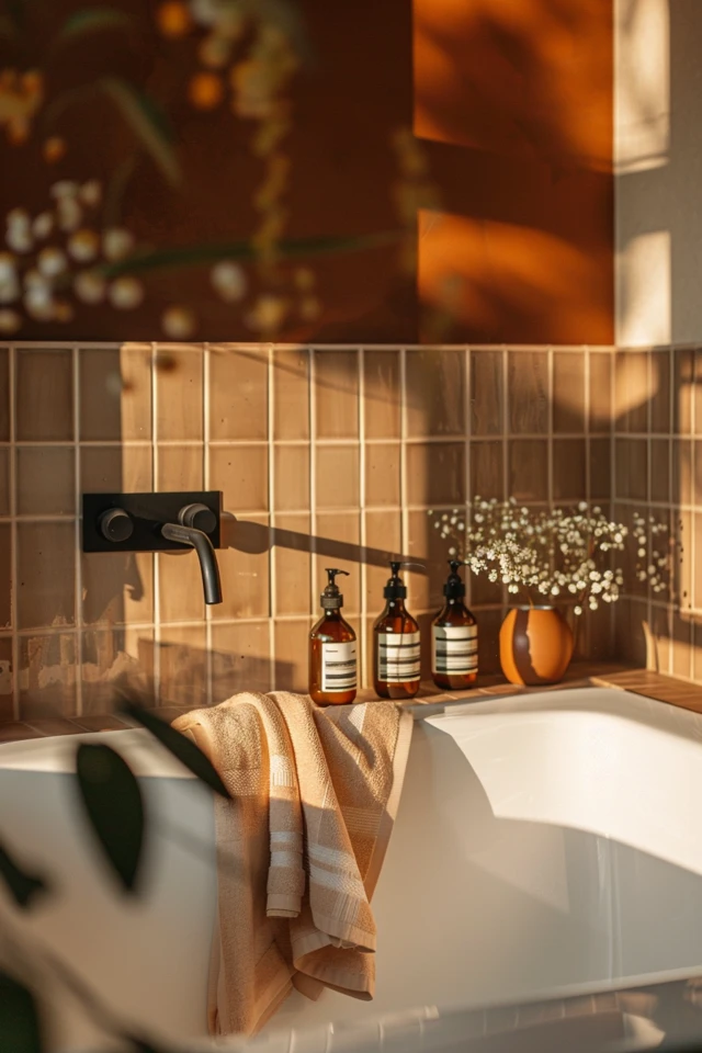
4. Metal Finishes and Hardware Coordination
Mixing metals adds character, but in a warm palette, you have to be careful not to introduce finishes that clash with the brown tones.
Unlacquered Brass
This is the champion of warm bathrooms. As it ages (patinas), it turns a dull, brownish-gold that looks incredible next to wood and cream stone.
Polished Nickel vs. Chrome
If you prefer silver tones, choose Polished Nickel over Chrome. Nickel has a gold undertone that warms it up. Chrome has a blue undertone that can look icy and cheap next to walnut or travertine.
Oil Rubbed Bronze
For a more rustic or traditional look, Oil Rubbed Bronze is a safe bet. It essentially acts as a dark brown neutral.
Placement Guide:
- Faucets: Keep these consistent (e.g., all brass).
- Cabinet Pulls: These can match the faucet or be matte black for a modern contrast.
- Mirror Frames: Feel free to mix. A wood vanity with brass pulls looks great with a matte black mirror frame.
5. Lighting and Textiles: The Final Layer
Lighting creates the mood. In a bathroom focused on warmth, clinical lighting is the enemy.
Color Temperature is Critical
Never use daylight bulbs (5000K) in a brown and cream bathroom. They will wash out the wood and make the cream walls look sickly green.
Stick to 2700K (warm white) or 3000K (soft white). This temperature mimics the glow of sunset and enhances the wood grain.
Sconce Placement
Install sconces at eye level, roughly 60 to 66 inches from the floor to the center of the junction box. This offers the most flattering light for the face.
Avoid placing lights only above the mirror, as this casts shadows under the eyes. Flanking the mirror is superior.
Textile Selection
Towels: Ditch the bright white hotel towels. Opt for oatmeal, sand, or even chocolate brown waffle-weave towels.
Rugs: Vintage runners work beautifully in these spaces. Look for wool rugs with terracotta and brown motifs.
Rug Sizing Rule: Ensure there are at least 4 to 6 inches of floor visible between the rug and the vanity or tub. A rug that touches the cabinets feels cramped.
Common Mistakes + Fixes
Mistake 1: The “Pink Beige” Trap.
Many cream tiles have a pink undertone, while many brown woods have a yellow or orange undertone. When put together, they clash horribly.
The Fix: Always bring a sample of your wood finish to the tile store. View them together in natural daylight, not just under showroom fluorescent lights.
Mistake 2: Ignoring Contrast.
A room that is entirely medium-beige looks muddy and boring.
The Fix: Ensure you have a “high” and a “low.” If your walls are light cream, your vanity should be dark walnut. If your floors are dark brown, your walls should be light.
Mistake 3: Over-styling with clutter.
Warm minimalism relies on breathing room.
The Fix: Limit counter accessories to a soap dispenser and perhaps one vase with dried branches. Store all plastic bottles and branded products inside drawers.
What I’d Do in a Real Project: Mini Checklist
If I were designing a 50-square-foot guest bath today using this palette, here is exactly what I would specify:
- Flooring: 12×24 inch Honed Travertine laid in a running bond (brick) pattern.
- Vanity: Floating walnut vanity with a flat-panel front to keep it modern.
- Countertop: Cream Quartzite (natural stone) with subtle brown veining.
- Walls: Tadelakt plaster in a “Bone” color for waterproof texture.
- Hardware: Aged Brass wall-mount faucet to save counter space.
- Lighting: Two alabaster sconces with brass backplates.
- Mirror: An arched pivot mirror in matte black to add a slight edge.
Final Checklist for Your Renovation
Use this list to ensure you haven’t missed any critical steps in your warm brown and cream bathroom design.
- Verify Undertones: Do your creams lean yellow or pink? Do they match the wood?
- Check Slip Resistance: Is your floor tile rated for wet areas (COF rating)?
- Order Samples: Never buy tile or paint without seeing a physical sample in your specific room’s lighting.
- Plan Storage: Do you have a place for ugly items (toilet paper, cleaning spray) so they don’t ruin the aesthetic?
- Measure Clearances: Do you have 30 inches of width for the toilet? Do vanity drawers hit the door frame?
- Test Paint: Paint a 2×2 foot patch on two different walls to see how light hits it throughout the day.
FAQs
Does a brown and cream bathroom look dated?
Not if done correctly. The “dated” look usually comes from shiny granite and heavy, ornate cabinetry. Keep lines clean, use matte finishes, and focus on natural materials to keep it timeless and modern.
Can I use black hardware with this palette?
Absolutely. Matte black acts as a grounding neutral. It adds a contemporary “punch” that prevents the room from looking too soft or sleepy. It works particularly well in light fixtures and mirror frames.
How do I keep a cream bathroom from looking dirty?
Texture and variation are key. Solid cream porcelain shows every hair and speck of dust. Cream stone or patterned ceramic hides debris much better. Also, opt for mid-tone grout rather than light grout on floors.
What is the best way to add color to this neutral palette?
Greenery is the best accent color. A potted fern, a vase of eucalyptus, or an olive tree (if space permits) brings life to the brown and cream tones without breaking the peaceful vibe.
Conclusion
Embracing a warm brown and cream palette is about more than just following a trend; it is about creating a sanctuary. This combination mimics the earth, sand, and wood, triggering a subconscious sense of calm that bright white bathrooms simply cannot achieve.
By focusing on natural materials like stone and wood, selecting lighting that glows rather than glares, and paying attention to undertones, you can build a space that feels curated and high-end. Trust your eye, test your samples, and enjoy the process of warming up your home.
Picture Gallery


