
Warm Up Your Space: Brown and Red Living Room Ideas
There is something inherently grounding about combining brown and red in a living space. This color pairing evokes the feeling of an old-world library, a cozy autumn lodge, or a sophisticated lounge. It creates a physical sense of warmth that cool grays and stark whites simply cannot replicate.
However, this palette is often misunderstood or labeled as dated because it was overused in the 1990s with heavy fabrics and poor lighting. When done correctly, mixing these earth tones requires a careful balance of texture, lighting, and scale to keep the room feeling fresh rather than heavy. If you just want visual inspiration, you can jump straight to the curated picture gallery at the end of this post.
In this guide, I will walk you through the practical steps of designing a living room using these rich hues. We will cover everything from selecting the right undertones to the specific measurements required for furniture layout, ensuring your space looks professionally styled and livable.
1. Anchoring the Room: Selecting the Right Brown Base
The most successful brown and red living rooms start with a substantial brown foundation. This usually comes from the largest pieces in the room, such as the flooring, the sofa, or expansive wood cabinetry. The goal is to establish a sense of permanence and warmth before introducing the energy of red.
When selecting a brown sofa, I almost always recommend leather for this specific color scheme. A cognac, chocolate, or espresso leather sofa provides a slight sheen that prevents the room from looking too matte or “dusty.” If you prefer fabric, look for a performance velvet in a mocha shade, which adds depth without the flatness of cotton twill.
Understanding Wood Tones
Wood finishes are the second layer of your brown base. The biggest mistake homeowners make is trying to match all the wood stains perfectly. This makes a room look like it was bought in a catalog set. Instead, aim to mix wood tones that share the same undertone.
- Walnut: This is a versatile, cool-leaning brown that works beautifully with deep burgundies.
- White Oak: A lighter option that prevents the room from feeling like a cave, especially if you have low ceilings.
- Mahogany or Cherry: Be very careful here. These woods have natural red undertones. If you have red walls and mahogany furniture, the room will vibrate visually.
Designer’s Note: The 60-30-10 Rule
In my projects, I treat brown as the 60% dominant color. It anchors the floor and the main seating. Red acts as the 30% secondary color, found in accent chairs, rugs, or drapery. The final 10% should be a neutral, like cream, charcoal, or brass, to provide visual relief. Without that 10% buffer, the room can feel suffocating.
2. Introducing Red: Accents vs. Statements
Red is a high-energy color, even in its darker variations. The key to using it in a living room is controlling the saturation and the surface area. I rarely paint all four walls bright red; instead, I use red as a powerful architectural tool or a focal point.
Choosing Your Red
Not all reds play well with brown. A “fire engine” red often looks cheap or jarring against natural wood. You want reds that are “muddy” or derived from nature.
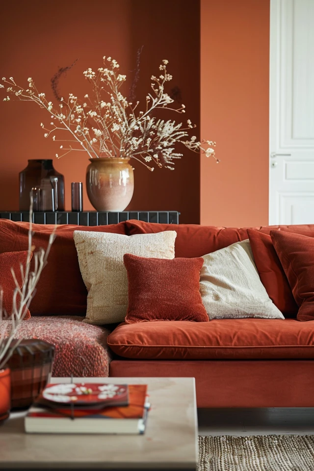
- Terracotta and Rust: These are orange-based reds. They pair exceptionally well with cognac leather and light oak. This creates a Southwestern or boho-modern vibe.
- Burgundy and Merlot: These are blue-based reds. They look expensive and traditional. Pair them with dark walnut woods and chocolate leather.
- Brick Red: This is the most versatile option for rustic or industrial spaces.
Common Mistakes + Fixes
Mistake: Buying a matching red loveseat and sofa set.
Fix: Break up the set. Keep the brown sofa and swap the loveseat for two fabric armchairs in a red pattern or a solid rust velvet. This creates a curated, collected look rather than a showroom aesthetic.
Real-World Constraint: Pet Hair
If you have pets, a solid red velvet chair is going to show every single light-colored hair. In households with shedding pets, I always specify a woven fabric or a tweed that incorporates red, brown, and a third neutral color. The variegation in the fabric hides fur and stains much better than a solid flat weave.
3. Textile Strategy: Rugs, Drapes, and Upholstery
Textiles are where you marry the brown and red together. Since both colors are visually heavy, you need texture to create separation between items. If you put a brown leather sofa on a dark hardwood floor, it disappears. You need a rug to create a visual break.
The Rug Rules
For this palette, the rug is the most critical unifier. I often lean toward vintage Persian or Turkish styles (or high-quality reproductions) because they naturally combine deep reds, browns, and blues.
- Sizing logic: In a standard 12×14 living room, avoid the 5×8 rug. It is too small and makes the room look cheap. Go for an 8×10 or 9×12 rug.
- Placement: Ensure the front legs of the sofa and the accent chairs are sitting on the rug. This anchors the conversation area.
- Material: If you are renting and have generic beige carpet, layer a large, thin vintage-style rug right on top. It defines the zone and adds the necessary color without painting walls.
Drapery and Height
Red curtains can be dramatic, but they can also close a room in. If your room is small, stick to oatmeal or linen-colored drapes and use a red leading edge (a strip of fabric sewn on the inside edge). If you have high ceilings (9 feet or higher), you can get away with floor-to-ceiling velvet drapes in rust or burgundy.
Measurement tip: Hang your curtain rod at least 4 to 6 inches above the window frame, or all the way to the crown molding. This draws the eye up. Ensure the curtains kiss the floor or break slightly (puddle) by 1 inch. Never let them hang 3 inches off the ground; it creates a “high-water” pants look.
4. Lighting Darker Tones: The 2700K Rule
Brown and red are light-absorbing colors. Unlike white or pale blue, which bounce light around a room, dark earth tones soak it up. This means a standard single overhead fixture will leave the corners of your room in shadow, making the space feel gloomy rather than cozy.
Layering Light Sources
You need at least three distinct sources of light in a living room with this palette.
- Ambient: This is your overhead fixture. Put it on a dimmer switch. This is non-negotiable for mood control.
- Task: Place a floor lamp behind the reading chair or a table lamp on the side table. The bottom of the lampshade should be roughly at eye level when you are seated (about 40-42 inches from the floor).
- Accent: Use picture lights over artwork or small up-lights behind a large plant. This adds depth to the shadows.
Color Temperature Matters
This is the most technical part of the design, but it makes the biggest difference. For a warm palette like red and brown, you must use bulbs with a color temperature of 2700K (Kelvin) to 3000K.
If you use a “Daylight” bulb (5000K), the light will be blue-white. This will turn your rich burgundy into a sickly purple and your warm wood into a flat beige. 2700K provides that soft, warm yellow glow that complements red and wood tones perfectly.
5. Walls and Accessories: Completing the Look
The final layer involves wall treatments and accessories. This is where you can inject personality and solve the “heaviness” issue often associated with this color scheme.
Paint and Wall Color
You generally have two paths: contrasting or drenching.
The High Contrast Path: Keep walls a warm white or creamy off-white (like Swiss Coffee or Greek Villa). This makes the brown furniture and red accents pop crisply. This is best for smaller rooms or rooms with limited natural light.
The Color Drench Path: Paint the walls a moody color. A deep charcoal, navy, or even a cocoa brown can look stunning. If you do this, you must have excellent lighting and lighter art work to provide contrast.
Accessorizing Shelves and Tables
When styling bookshelves or coffee tables in a red and brown room, avoid adding more dark items. You need relief.
- Metallics: Brass and unlacquered gold are the best metal finishes for this palette. Silver or chrome can feel too cold.
- Ceramics: Use cream, stone, or light gray pottery.
- Greenery: Real plants are essential. The green provides a natural complementary color to the red and breathes life into the brown tones. A large Ficus or a Snake Plant in a basket works wonders.
What I’d Do in a Real Project: The Mini Checklist
If I were designing a brown and red living room today, here is the exact formula I would use to ensure success:
- Walls: Warm, creamy white to maximize light.
- Sofa: Cognac leather sectional (easy to wipe down, ages well).
- Chairs: Two rust-colored velvet swivel chairs.
- Rug: A vintage-style Persian rug with navy, red, and cream tones.
- Coffee Table: A round marble top table (to break up all the wood and leather).
- Lighting: Brass floor lamp with a 2700K LED bulb.
Final Checklist
Before you start purchasing furniture or painting walls, run your plan through this checklist to ensure you have covered the functional bases.
- Traffic Flow: Do you have at least 30 to 36 inches of walking space between furniture pieces?
- Coffee Table Distance: Is the coffee table 14 to 18 inches away from the sofa? This allows for legroom but keeps drinks within reach.
- Rug Size: Does the rug extend at least 6 to 8 inches past the sides of the sofa?
- Texture check: Do you have at least three different textures? (e.g., Leather, velvet, wood, metal, wool).
- Lighting: Do you have lights at different heights (ceiling, table, floor)?
- Palette Balance: Is there a neutral color (cream, white, gray) present to rest the eye?
FAQs
Can I use red and brown in a small living room?
Yes, but focus on the “High Contrast” approach. Keep the walls light and neutral. Use a sofa with legs raised off the floor (rather than a heavy skirted base) to show more floor area, which tricks the eye into thinking the room is larger. Keep the red to accents like pillows and a rug rather than heavy drapes.
Does gray furniture work with brown and red?
It can, but the shade of gray is critical. You need a “warm gray” or “greige” (gray-beige). A cool, blue-steel gray will clash with the warmth of the wood and red tones. If you have a gray sofa, bring in warmth through a rust-colored throw blanket and a wood coffee table.
How do I stop the room from looking like a 90s theme restaurant?
The “fast food” look happens when you use bright yellow, bright red, and shiny surfaces. Avoid primary yellow accents. Instead of bright yellow, use mustard or ochre. Ensure your finishes are matte or satin, not high-gloss. Incorporate plenty of white or cream negative space.
What color curtains go with brown furniture and red walls?
If you have red walls, do not use red curtains. It will look like a theater. Go with oatmeal, flax, or a heavy cream linen. This provides necessary contrast and brightens the space. If you want pattern, a subtle plaid or stripe in neutral tones works well.
Conclusion
Designing a living room with brown and red is about embracing warmth and character. It is a bold departure from the safety of all-gray interiors, offering a space that feels inhabited and secure. By paying attention to the undertones of your wood, layering your lighting to combat the darkness, and varying your textures, you can create a space that feels timeless rather than dated.
Remember that design is iterative. Start with your brown anchors, layer in your red energy, and refine with lighting and personal artifacts. The result will be a home that feels uniquely yours.
Picture Gallery


