
Western Paint Ideas for Rustic Home Charm
There is a distinct shift happening in interior design right now, moving away from the stark, sterile whites of minimalism toward something warmer, grounded, and historically rich. Western design is at the forefront of this movement, but I am not talking about kitschy cowboy motifs or wagon wheels. Modern western style is about pulling the palette of the American landscape—high desert clays, deep forest greens, and moody storm-cloud grays—into the home to create a sanctuary that feels built to last.
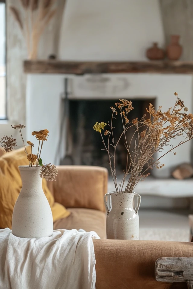
When clients come to me asking for a “rustic” look, they are often afraid the space will feel dark or dated. The secret lies entirely in the undertones of your paint and how those colors interact with natural materials like raw wood beams, leather upholstery, and stone fireplaces. If you are looking for visual inspiration to guide your renovation, be sure to scroll all the way down because we have curated a comprehensive Picture Gallery at the end of the blog post.
In this guide, I will walk you through the specific paint strategies I use to achieve that sophisticated western aesthetic. We will cover texture, light reflectance, and the exact color families that bridge the gap between rugged and refined.
1. The New Western Palette: Earth-Based Hues
The foundation of western design is a connection to the outdoors. When selecting paint, we strictly avoid “candy” colors or highly saturated primary colors. Every color you choose should look like it could be found in nature, specifically in the landscapes of the American West.
This usually means colors that are “muddy” or “dusty.” These desaturated tones act as neutrals, allowing you to paint an entire room without it feeling overwhelming.
High Desert Warmth
For a home that feels sun-drenched and welcoming, look toward terracotta, clay, and sand. Unlike the bright oranges of the 1970s, these shades have brown or pink undertones. They work exceptionally well in living rooms or dining areas where you want to stimulate conversation and appetite.
- Baked Clay: A deep, rusty red that grounds a large room.
- Dusty Blush: A pale, sandy pink that reads as a neutral in the evening light.
- Camel: A rich, golden tan that pairs perfectly with leather furniture.
Mountain Moody
If your style leans more toward a cabin in the Rockies or the Pacific Northwest, you need cool, deep tones. These colors recede, making walls feel further away, which can actually make a cozy room feel grander.
- Sage and Olive: Green is the new neutral. A gray-green works beautifully on cabinetry.
- Charcoal and Slate: Instead of stark black, choose a soft, chalky charcoal. It is less harsh and pairs better with wood.
- Stormy Blue: A dark, gray-blue that mimics a rainstorm. This is perfect for bedrooms or offices.
Designer’s Note: One lesson I learned the hard way involves red undertones. In a west-facing room, the setting sun will intensify warm paint colors. A subtle terracotta can turn neon orange at 5:00 PM. Always test your paint on the west wall specifically to see how the “golden hour” affects the saturation.
2. Finishes and Textures: Beyond Standard Latex
In western and rustic design, the texture of the wall is just as important as the color. Standard semi-gloss or eggshell finishes can sometimes look too “plastic” or manufactured for a rustic home. We want walls that feel aged and authentic.
The Power of Limewash
Limewash paint is my number one recommendation for achieving instant character. It is a mineral-based paint that creates a mottled, chalky suede-like texture. It adds depth and movement to the walls that flat paint simply cannot achieve.
Because western design relies on simplicity, the walls need to do some of the work. Limewash reflects light in a scattered way, softening the entire room. It is particularly effective on fireplace surrounds or feature walls.
Choosing the Right Sheen
If limewash is out of budget or not practical for your lifestyle, you must be intentional about your paint sheen.
- Flat/Matte: Use this for ceilings and low-traffic walls (like a master bedroom). It hides imperfections in the drywall and looks the most like plaster.
- Matte Enamel: This is a newer technology available from many premium brands. It has the dull look of flat paint but the scrubbability of an eggshell finish. I use this exclusively for hallways and living rooms.
- Satin: Reserve this only for trim and cabinetry. In a rustic home, high-gloss trim can look out of place.
Handling Wood Trim
Many rustic homes have beautiful wood casing around windows and doors. Do not paint this unless it is damaged or poor-quality pine. If you must paint the trim, consider a monochromatic look.
Common Mistakes + Fixes:
- Mistake: Painting walls a dark moody color but leaving the trim bright white.
- Fix: This creates a “stripe” effect that breaks up the room and lowers the ceiling height visually. Instead, paint the trim the exact same color as the walls, but in a satin finish. This “color drenching” technique is very modern-western and makes the room feel taller.
3. Room-Specific Application Strategies
Applying western paint colors requires a different approach for different spaces. The goal is to create a mood, not just cover drywall. Here is how I approach the main zones of a home.
The Great Room
In large, open-concept spaces with high ceilings, you need a color that anchors the room. If you have a stone fireplace, pull a mid-tone color from the stone (usually a taupe or warm gray) for the walls.
If you have vaulted ceilings with wood beams, keep the ceiling white (a warm white, never blue-white) to let the wood pop. If the beams are painted, you lose the rustic appeal.
The Kitchen
Two-tone cabinets are a staple in western design. It mimics the look of unfitted furniture.
- Lowers: Go dark. Forest green, navy, or charcoal. This hides scuffs and grounds the cabinetry.
- Uppers: Keep them a warm white or replace them with open wood shelving.
- Island: This is a chance for an accent. A natural wood island with painted perimeter cabinets is a classic reverse approach.
The Bedroom
This is where I go dark. A bedroom painted in a deep espresso or midnight blue creates a cave-like, cozy atmosphere that promotes sleep.
Real-World Project Checklist:
When I design a western-style bedroom, I follow this formula:
1. Paint walls, trim, and doors the same deep color.
2. Ensure the rug is large enough (it should extend 18 inches beyond the bed sides).
3. Use light-colored bedding (linen or wool) to provide contrast against the dark walls.
4. Lighting: The Invisible Paint Color
You cannot select a paint color without addressing your lighting. Rustic colors are heavily influenced by the Kelvin temperature of your light bulbs.
Because western palettes are warm and earthy, using cool-toned LEDs (4000K-5000K) will kill the vibe instantly. It will turn your warm grays into sick greens and your terracottas into muddy browns.
The 2700K vs. 3000K Rule
- 2700K (Soft White): This mimics the glow of incandescent bulbs and firelight. It is the gold standard for rustic living rooms and bedrooms. It enhances wood tones and makes warm paint colors glow.
- 3000K (Warm White): Use this in kitchens and bathrooms where you need task lighting. It is crisp but still warm enough not to clash with earthy paint.
Natural Light Direction
- North-Facing Rooms: The light is blue and cool. Avoid gray paint here; it will look dead. You need warmer tones like camel or beige to counteract the blue light.
- South-Facing Rooms: These get intense, warm light. You can get away with cooler grays and dark blues here, as the sun will warm them up naturally.
Designer’s Note: When viewing paint chips, hold them vertically against the wall, not flat on a table. Light hits a vertical surface differently than a horizontal one. I always tell clients to paint a large foam core board (24″ x 36″) and move it around the room for two days before committing.
5. Integrating Paint with Rustic Materials
Paint is the backdrop, but the materials are the stars of the show in a western home. The paint must support the hard finishes, not fight them.
Working with Stone
If you have a large stone feature, the paint color should exist somewhere within that stone. Stand back and squint at the stone—what is the overall background color? Is it gray, brown, or gold? That is your starting point for the wall color.
Pro Rule: Never match the paint to the darkest stone. It will make the room feel heavy. Match it to the grout or the mid-tone stone.
Working with Leather
Leather furniture is a staple of this aesthetic.
- Cognac/Saddle Leather: Looks incredible against navy blue, charcoal, or sage green walls.
- Dark Chocolate Leather: Needs lighter walls (warm white, cream, or light taupe) to avoid disappearing into the shadows.
Working with Wood Floors
The undertone of your wood flooring dictates your paint choice.
- Red/Orange Wood (Cherry, Mahogany): Avoid red or orange paints. Green is the complementary color and will balance the redness of the wood beautifully.
- Yellow/Golden Wood (Oak, Pine): Avoid cool grays. Stick to warm creams and warm greiges.
- Walnut/Dark Wood: You have the most freedom here. Almost any western color works, but lighter walls will show off the grain better.
Final Checklist: What I’d Do in Your Home
If I were consulting on your project today, this is the step-by-step process we would follow to finalize your paint plan:
1. Identify Fixed Elements: List the things that are not changing (flooring, fireplace stone, sofa color).
2. Determine Exposure: Compass check every room. Is it North, South, East, or West facing?
3. Select 3 Core Colors: Pick one white for ceilings/trim, one neutral for main areas, and one accent for cozy rooms (office/bed).
4. Sample Correctly: Buy Samplize sheets or paint large poster boards. Do not paint splotches on the wall—the current wall color will distort your perception of the new color.
5. The “Lights Off” Test: Check the color at night with only your floor lamps on. Western homes rely on mood lighting; the paint must look good in dim light.
6. Check the LRV: Look at the Light Reflectance Value on the back of the fan deck. For a moody rustic room, aim for an LRV between 10 and 20. For a main living area, aim for 50-60.
FAQs
Can I use these colors in a small rental apartment?
Absolutely. Landlord beige is actually a great base for western style if you add the right textures. If you are allowed to paint, try color drenching a small entry or hallway in a dark terracotta. In small spaces, dark colors blur the corners and make the space feel infinite, not smaller.
How do I mix “Western” with “Modern” without it looking confused?
The key is the silhouette of your furniture. Use the rustic paint colors and textures we discussed, but keep your furniture lines low, clean, and modern. Avoid heavy, rolled-arm sofas or furniture with intricate carvings. The paint provides the warmth; the furniture provides the modern edge.
Is gray paint dead in western design?
Cool, steel gray is on its way out. However, “greige” (gray-beige) and warm, brown-based grays are timeless staples of the western aesthetic. They mimic the color of tree bark and stone. Just ensure the gray you pick has a brown undertone, not a blue or purple one.
What is the best white paint for a rustic home?
You never want a sterile, hospital white. Look for “creamy” whites or whites with a yellow/red undertone. These soften the transition between white walls and wood beams. Stark white makes natural wood look dirty by comparison; creamy white makes it look rich.
Conclusion
Embracing western paint ideas is about more than just a color swatch; it is about cultivating a feeling of grounded calmness. By utilizing earth tones like sage, terracotta, and warm charcoal, and pairing them with tactile finishes like limewash or matte enamel, you bring the serene beauty of the American landscape indoors.
Remember that this design style celebrates imperfection. It welcomes the changing light of the day and prioritizes warmth over crisp perfection. Take your time testing samples, pay attention to your lighting, and do not be afraid to go darker than you initially think. The result will be a home that feels authentic, rugged, and incredibly inviting.
Picture Gallery


