
Chic Pink and Green Bedroom Ideas for Adults
Introduction
Pink and green is a color combination that often gets a bad rap in the interior design world. Many people immediately picture a nursery, a preppy country club from the 1980s, or a slice of watermelon. However, when executed with the right saturation and textures, this pairing is actually one of the most sophisticated choices for an adult bedroom. It balances the calming, biophilic nature of green with the warmth and softness of pink.
I recently worked with a couple where one partner wanted a moody, masculine “club” vibe, and the other wanted something soft and romantic. The solution was not compromise, but combination. We used a deep, desaturated forest green for the walls and introduced dusty rose through velvet upholstery and washed linen bedding. The result was a space that felt layered, expensive, and entirely grown-up. It is all about choosing the right tones and stepping away from primary colors.
If you are struggling to visualize how these colors can look elegant rather than juvenile, To see visual examples of how these colors interact in real spaces, check out the Picture Gallery at the end of this post. In this guide, I will walk you through the practical steps of designing this palette, from selecting paint to determining the correct rug size for your layout.
1. Mastering the Color Palette: Tone and Saturation
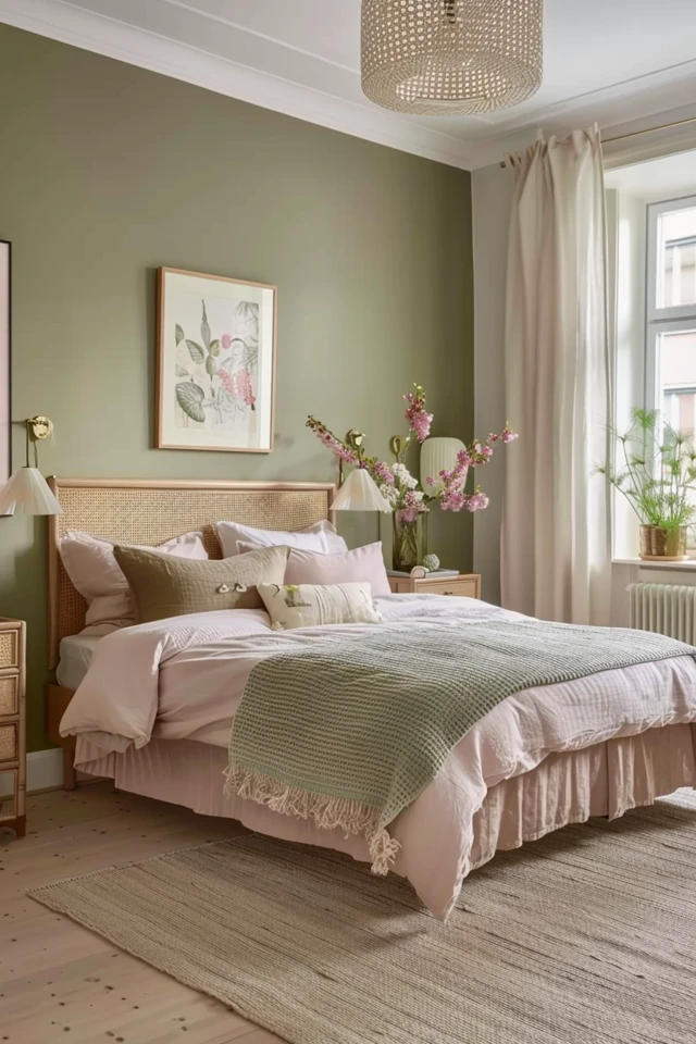
The biggest mistake DIYers make with pink and green is matching the saturation levels too closely. If you pick a bright lime green and a hot pink, the room will vibrate visually and feel chaotic. To make this look work for adults, you must play with undertones.
The rule of thumb I use in the studio is to let one color be the “anchor” and the other be the “accent.” You rarely want a 50/50 split. Usually, green makes the best anchor because it acts as a neutral. Think of olive, sage, or hunter green. These shades recede visually, making the room feel larger and grounded.
Pink works best as the softener. Instead of bubblegum, look for terracotta, blush, mauve, or a pink with brown undertones. When you pair a “dirty” pink (one mixed with grey or brown) with a deep green, it creates high-end tension.
Designer’s Note: The 60-30-10 Rule
In a bedroom, your color breakdown should generally follow this ratio to avoid visual fatigue:
- 60% Dominant Color: This is usually your wall color or your largest furniture pieces. A deep forest green or a soft sage works well here.
- 30% Secondary Color: This is your bedding, curtains, or an area rug. This is where your dusty rose or terracotta comes in.
- 10% Accent/Neutral: This is crucial. You need brass, wood, cream, or black to break up the color. Without a neutral, the room will feel claustrophobic.
Common Mistakes + Fixes
Mistake: Using “clean” colors that look like a crayon box.
Fix: Swatch your paints and fabrics. Look for “muddy” versions of the colors. If the green looks too bright, go for a shade with more grey in it. If the pink feels too sweet, look for a shade closer to clay or plaster.
2. Selecting Materials and Textures
Color is flat without texture. In a dual-tone room, texture is what separates a professional design from a basic setup. Because pink and green are on opposite sides of the color wheel, they provide high contrast. You need texture to bridge that gap.
For the green elements, especially if they are darker, I prefer materials that absorb light. Velvet is a fantastic choice for a green headboard or an accent chair because it gives the color depth and variation. A flat cotton green fabric can look like a surgical scrub suit, whereas green velvet looks like moss.
For the pink elements, lean into natural textures. Washed linen is my go-to for bedding in this palette. The wrinkles and matte finish of linen tone down the femininity of pink, making it feel casual and relaxed. If you prefer a more glamorous look, a silk or sateen pink throw pillow works, but use it sparingly.
Integrating Wood Tones
Wood is the great equalizer in a pink and green room. It serves as the bridge that connects the organic feel of the green with the warmth of the pink.
- Walnut and Mahogany: Darker woods add formality and weight. They look stunning against sage or olive walls.
- White Oak and Birch: Lighter woods create a Scandi or Californian vibe. This works better if your green is more of a pastel or mint tone.
- Avoid Red-Toned Woods: Be careful with cherry or red-stained pine. Since green is the complement to red, a red-toned wood can clash aggressively with your green walls. Stick to neutral or ash-toned woods.
3. Wall Treatments and Paint Placement
How you apply the color to the walls dictates the energy of the room. In a bedroom, the goal is usually rest, so we want to avoid high-energy patterns on every wall.
If you have a small room (under 12×12 feet), I often recommend painting the walls green and the ceiling a crisp white or a very pale pink. Dark green walls blur the corners of the room, tricking the eye into thinking the space is larger than it is.
The Half-Wall Approach
If you are nervous about committing to a full room of color, or if you are working with a lower ceiling height, a wainscoting or half-wall effect is practical.
The Rule of Thumb for Height: If you are painting a two-tone wall, never split the wall exactly in half. It makes the ceiling feel lower. Instead, apply the “rule of thirds.”
- Low Horizon: Paint the bottom 36 to 42 inches green (roughly chair rail height) and leave the top neutral. This grounds the furniture.
- High Horizon: Paint the top 12 to 18 inches a different color (or run the ceiling color down). This is a picture rail effect and adds height.
Wallpaper Considerations
Wallpaper is a massive trend, but it can be overwhelming. In a pink and green scheme, I prefer botanical prints where the background is green and the floral accents are pink. This feels natural.
If you are renting, peel-and-stick wallpaper is a viable option, but surface preparation is key. You must clean the walls with isopropyl alcohol and water before applying, or the adhesive will fail within six months.
4. Furniture Selection and Scale
Scale is the unsexy part of interior design that matters the most. You can have the perfect color palette, but if your furniture is too big or too small, the room will feel “off.”
In a bedroom, the bed is the anchor. If you choose a green velvet headboard, ensure it is substantial enough to handle the visual weight of the color. A thin metal frame painted green might get lost.
Nightstand Dimensions
When mixing colors, visual symmetry helps calm the eye. Matching nightstands are usually safer in a bold color room than mismatched ones.
Practical Measurements:
- Height: Your nightstand should be level with the top of your mattress, or up to 2 inches higher. Never lower. Reaching down for a glass of water is ergonomically poor and looks visually unbalanced.
- Width: For a King bed, aim for nightstands at least 24-30 inches wide. For a Queen, 20-24 inches is standard. If you use tiny nightstands next to a large bed, the room looks cheap.
Traffic Patterns
Don’t let your design impede your movement. I always ensure there is a minimum of 30 inches of walking space on either side of the bed. Ideally, you want 36 inches to comfortably make the bed without hitting your shins. If your room is tight, skip the dresser and install a closet organization system to save floor space.
5. Styling Accessories and Lighting
Lighting changes how we perceive color. Green paint is notoriously tricky; it can read grey, brown, or electric teal depending on the light bulbs you use.
Lighting Rules:
- Color Temperature: Always use bulbs between 2700K and 3000K (Soft White to Warm White). Anything over 3500K will turn your pinks into a harsh magenta and your greens into a clinical blue-green.
- Layers: You need three layers. Ambient (ceiling fixture), Task (bedside lamps), and Accent (mood lighting). In a moody green room, rely more on lamps than the overhead light.
Rug Sizing and Placement
The rug is often the best place to introduce the secondary color or a pattern that ties the pink and green together. A vintage-style Turkish runner or area rug often has both of these colors naturally woven in.
Designer Rules for Rugs:
- Queen Bed: Use an 8×10 rug. Place the rug perpendicular to the bed. It should stop a few inches away from your nightstands. This ensures you have soft rug underfoot when you step out of bed.
- King Bed: You need a 9×12 rug. An 8×10 will look like a postage stamp under a King bed.
- The “2/3 Rule”: Only the bottom two-thirds of the bed should sit on the rug. The nightstands should generally sit on the bare floor (unless the room is massive and the rug anchors everything).
Curtains and Window Treatments
To elevate the look, your curtains should be high and wide.
- Mounting Height: Install the curtain rod 4 to 6 inches above the window frame, or all the way to the ceiling molding if possible.
- Width: Extend the rod 8 to 12 inches past the window frame on each side. When the curtains are open, they should frame the window, not block the glass. This maximizes natural light, which is essential for keeping green walls from feeling gloomy.
Final Checklist: What I’d Do in a Real Project
If I were hired to design a pink and green bedroom today, here is the exact workflow I would follow to ensure success:
- Step 1: Select the green paint first. I would test 3 large swatches (2×2 feet) on different walls and watch them for 24 hours.
- Step 2: Choose the bedding. It is easier to match paint to fabric than fabric to paint. I’d source a duvet cover in a texture I love.
- Step 3: Plan the layout. I would tape out the position of the bed and rug on the floor using painter’s tape to verify clearances.
- Step 4: Buy the rug. I would ensure it is large enough (8×10 for Queen) and has touches of the wall color in it.
- Step 5: Install lighting. I would swap out any existing cool-tone bulbs for warm 2700K LEDs immediately.
- Step 6: Accessorize. I would finish with brass hardware and maybe a terracotta pot with a live plant to bridge the colors.
FAQs
Q: Will a pink and green room look too feminine for a shared bedroom?
A: Not if you control the saturation. Lean heavily into dark, forest greens or olive tones for the walls and large furniture. Use pink as a “leather” or “clay” tone rather than a floral pink. Think of it as “earth and foliage” rather than “pink and green.”
Q: Can I use this palette in a room with low light?
A: Yes, but embrace the moodiness. Don’t try to make a dark room look bright with white paint; it just looks gray. Paint it a rich medium-to-dark green. It will feel cozy and enveloping. Just ensure you have plenty of lamps.
Q: What metal finish goes best with pink and green?
A: Unlacquered brass or antique gold is the gold standard (pun intended) for this palette. The warmth of the gold complements the pink and contrasts beautifully with the green. Matte black is a good second choice for a modern industrial look. Chrome tends to look too cold.
Q: How do I incorporate pink without painting the walls?
A: Keep the walls green or neutral and use pink for the “soft goods.” A chunky knit throw blanket, euro shams on the bed, or a velvet bench at the foot of the bed are low-risk ways to add the color.
Conclusion
Designing a chic pink and green bedroom is about balance and confidence. By stepping away from primary colors and embracing complex undertones like sage, olive, terracotta, and dusty rose, you create a space that feels curated and restful. Remember to pay attention to your textures—mix the roughness of linen with the smoothness of velvet—and ensure your furniture scale allows for comfortable movement.
This color combination brings the best of the outdoors inside, offering a sanctuary that is both energizing and relaxing. Don’t be afraid to test samples and move things around until it feels right. Design is an iterative process.
Picture Gallery


