
Grey Carpet Wall Color Ideas to Transform Your Space
Grey carpet is widely considered the “safe choice” in modern home building and renovation. It is durable, hides dirt relatively well, and theoretically matches everything.
However, many homeowners find themselves staring at a sea of grey flooring, feeling unsure of how to bring life to the room. If you pick the wrong wall color, that neutral carpet can suddenly look purple, dingy, or flat.
We have compiled a massive Picture Gallery at the end of this post to give you visual inspiration for your next project.
The secret to choosing the right wall color lies in understanding the specific temperature of your grey carpet. Once you unlock that, you can turn a basic room into a sophisticated, designer-level space.
1. Decoding the Undertone: The Paper Test
Before you buy a single sample pot of paint, you must identify the undertone of your carpet. Grey is rarely just a mix of black and white; it almost always leans toward blue, green, violet, or taupe.
If you skip this step, you risk creating a visual clash that feels “off” without knowing why. For example, a cool blue-grey carpet will make a warm cream wall look dirty and yellow.
To find the undertone, take a piece of bright white printer paper and lay it on the floor in natural daylight. Do not use artificial light for this initial test, as bulbs can skew the color.
Look at the carpet right next to the stark white paper. Does the grey look steely and cold? That is likely a blue or cool undertone.
Does it look like a mushroom or a stone? That is likely a green or beige (warm) undertone. If it looks vaguely like lavender, you have a violet undertone, which is common in plush synthetic carpets.
Designer’s Note: The “Clash” Lesson
I once worked on a living room refresh where the client insisted on a popular “greige” paint color. They had a steel-grey carpet installed the year prior.
Once the paint was up, the walls looked pink, and the carpet looked baby blue. It was a disaster because the warm purple undertones in the paint fought with the cool blue undertones in the carpet. We had to repaint everything with a cooler, crisp white to neutralize the floor.
Common Mistakes + Fixes
Mistake: Relying on paint chips in the hardware store.
Fix: Store lighting is usually fluorescent and cool. Always paint a large swatch (at least 12×12 inches) on a poster board and place it directly against the carpet in your actual room.
Mistake: Ignoring the time of day.
Fix: Check your swatch in the morning, at noon, and at night with your lamps on. Grey changes drastically based on shadow.
2. Crisp Whites and Off-Whites: The Modern Gallery Look
If your goal is to make a room feel larger, cleaner, and more open, white walls are the primary contender. However, matching white walls to grey carpet requires precision.
For cool grey carpets (blue/steely undertones), you want a crisp, stark white. A pure white without yellow mixed in will make the floor look intentional and modern. It creates a high-contrast “gallery” look that is excellent for displaying art.
For warm grey carpets (stone/taupe undertones), a stark white can feel too clinical or hospital-like. Instead, opt for a creamy off-white or a soft vanilla.
This bridges the gap between the floor and the ceiling. The warmth in the paint picks up the brown notes in the carpet fibers, making the room feel cozy rather than sterile.
Rules of Thumb for Trim
When painting walls white, the transition to the floor (the baseboard) matters immensely.
If you have a standard 3-inch baseboard, paint it the exact same color as the wall but in a different sheen. Use eggshell or matte on the walls and semi-gloss or satin on the trim.
If you have taller, architectural baseboards (5 inches or more), you can create contrast. A pure white trim creates a frame for slightly off-white walls, adding depth to the room.
Practical Constraints: The “Dirt” Factor
If you have kids or large pets, pure white walls near the floor can be a nightmare. Scuff marks from shoes or vacuum cleaners show up instantly.
In high-traffic zones like hallways, I recommend using a “Scuff-X” or high-durability matte finish. These specialized paints allow you to scrub the wall without burnishing the finish, keeping that crisp look longer.
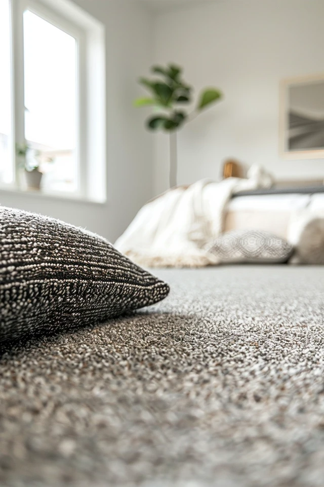
3. Moody Blues and Greens: Creating Depth and Calm
Grey carpet is an excellent anchor for nature-inspired colors. Because grey is inherently essentially a shadow tone, it pairs beautifully with colors found in landscapes.
Navy blue is a powerhouse pairing for light grey carpet. The high contrast grounds the room. This combination works exceptionally well in bedrooms or media rooms where you want to induce a sense of rest.
When choosing a navy, ensure it is dusty or “muted.” A bright royal blue can look cheap against grey carpet. You want a blue that has a little bit of grey mixed into it already.
Forest green or sage is the other top contender. Green adds life to the sterile nature of grey.
A warm, olive-green wall pairs perfectly with “greige” or taupe carpets. The yellow undertones in the green harmonize with the warmth of the carpet.
Lighting Considerations for Dark Colors
Dark walls soak up light. If you go with a moody navy or forest green, you must assess your lighting plan.
Lumens Matter: A standard 800-lumen bulb might not be enough. You may need to upgrade to 1100 or 1600 lumens in your floor lamps to compensate for the light absorption.
Kelvin Temperature: Stick to 2700K to 3000K (warm white) bulbs. If you use 5000K (daylight) bulbs with dark walls, the room will feel like an interrogation room or a commercial garage.
What I’d Do in a Real Project
If I am designing a bedroom with standard light grey carpet, I often paint the wall behind the bed a deep, dusty teal. I leave the other three walls a soft grey-white.
This draws the eye to the headboard and minimizes the focus on the carpet. It creates a focal point that lifts the gaze upward, making the carpet feel like a supporting character rather than the main event.
4. Monochromatic Grey-on-Grey: Texture is Key
Can you paint your walls grey if your carpet is grey? Absolutely, but it is the hardest look to pull off correctly.
The danger is creating a “concrete box” effect where the room feels lifeless. To make this work, you must vary the shades significantly.
If your carpet is a dark charcoal, go with a very light, misty grey on the walls. If your carpet is a light silver, try a mid-tone flannel grey on the walls. You need at least two shades of difference for the eye to register separation.
Texture Over Color
When the color palette is monochromatic, texture becomes the new color. You cannot have flat walls and flat carpet.
If the carpet is a low-pile loop (Berber style), consider adding wainscoting, beadboard, or picture molding to the walls. The shadow lines from the millwork add the necessary visual interest that color usually provides.
If you cannot add millwork, use a textured wallpaper (like a grasscloth) in a grey tone. The physical weave of the wallpaper plays against the weave of the carpet, making the room feel rich and layered.
Common Mistakes + Fixes
Mistake: Matching the paint chip perfectly to the carpet fibers.
Fix: Never match 100%. Always go at least 20% lighter or darker. A perfect match creates a disorienting “bowl” effect where you can’t tell where the floor ends and the wall begins.
Mistake: Using cool grey paint with warm grey carpet.
Fix: This is the clash mentioned earlier. If you want grey walls, they must share the same temperature family as the carpet. Warm goes with warm; cool goes with cool.
5. Bold Accents and “Jewel Box” Rooms
Sometimes the best way to handle grey carpet is to ignore it completely and go bold on the walls. Grey is a neutral, meaning it can technically sit quietly beneath vibrant colors.
This approach works best in small spaces like home offices, powder rooms (if carpeted), or guest rooms. We call these “jewel box” rooms.
Think deep burgundy, eggplant purple, or a burnt terracotta. These rich, saturated colors draw all the attention. The grey carpet simply acts as a quiet acoustical damper.
The 60-30-10 Rule
When using bold wall colors with grey carpet, follow this classic ratio to keep the room balanced:
60% Main Color: This is your wall color (e.g., Deep Terracotta).
30% Secondary Color: This is your grey carpet and perhaps a large grey sofa or headboard.
10% Accent Color: This should be a metal (brass or gold) or a sharp contrast (black or white) in your lamps, frames, and hardware.
Transition Strips
If you paint a room a bold color, be mindful of the transition strip where the carpet meets the hallway flooring (usually wood or tile).
If the door is often open, ensure your bold wall color doesn’t clash with the flooring in the adjacent hallway. The view from the hallway into the room should feel cohesive.
6. Styling Around the Choice: Rugs, Curtains, and Furniture
Once the walls are painted, you aren’t done. The way you furnish the room determines how the wall color interacts with the carpet.
Can You Put a Rug on Carpet?
Yes. In fact, I highly recommend it. Layering a rug over wall-to-wall carpet defines zones and breaks up the expanse of grey.
The Texture Rule: If your carpet is low-pile, choose a thick, high-pile rug (like a shag or Moroccan wool). If your carpet is plush, choose a flat-weave or woven rug. Contrast is king.
Sizing: Ensure the rug is large enough. For a living room, at least the front feet of the sofa and chairs should sit on the area rug. A floating “postage stamp” rug looks cheap and accidental.
Curtain Logic
Your curtains are the vertical bridge between the wall and the floor. They can hide a multitude of sins.
If your grey carpet feels too cool for the room, choose linen curtains in a warm oatmeal or flax color. Hang them high (almost at the ceiling) and let them “kiss” the floor.
This vertical column of warm fabric draws the eye up and creates a warm boundary that distracts from the cool floor.
Furniture Materials
Grey carpet loves wood and leather. The organic warmth of a walnut coffee table or a cognac leather armchair cuts through the synthetic feel of carpeting.
Avoid grey furniture if you have grey carpet and grey walls. It is too much. You need the warmth of wood grain or the shine of metal to create a balanced interior.
Final Checklist: Your Project Roadmap
Ready to start painting? Follow this step-by-step checklist to ensure you don’t miss a beat.
1. The Paper Test: Lay white paper on the floor to determine if your grey is Blue, Green, Violet, or Taupe.
2. Sample Selection: Pick 3-4 paint colors based on that undertone.
3. The Board Test: Paint 12×12 inch boards. Do not paint directly on the wall yet.
4. Lighting Check: Observe the boards against the carpet in the morning, afternoon, and night.
5. Trim Check: Hold the board against your existing trim. Does the trim look yellow? You may need to repaint baseboards to a crisp white.
6. Prep: Tape off baseboards thoroughly. Carpet fibers love to grab paint splatters and they are impossible to clean.
7. Purchase: Buy high-quality paint. The coverage is better, and the color pigment is truer.
8. Execute: Paint the walls.
9. Style: Add warm wood tones, a layered rug, and proper lighting (2700K-3000K).
FAQs
What if I am renting and can’t paint?
If you are stuck with grey carpet and white walls in a rental, focus on what you can cover. Use large area rugs to cover 70% of the carpet. Use “peel and stick” wallpaper on an accent wall to draw the eye up. Use floor-to-ceiling curtains to cover large sections of the wall.
Can I mix beige walls with grey carpet?
Yes, but you have to be careful. This combination is often called “Greige.” You need a beige that is not too yellow. Look for “mushroom” or “taupe” paint colors. These bridge the gap between brown and grey effectively. Avoid butter-yellow beiges; they will look dated against grey.
Should I paint the ceiling?
In most cases with grey carpet, a flat white ceiling is best to reflect light. However, if you are doing a moody room (like the navy example), painting the ceiling the same dark color as the walls can create a cozy “cocoon” effect. This works best in rooms with high ceilings (9 feet or higher).
My grey carpet looks purple. What color cancels that out?
To neutralize a purple undertone, avoid yellow or green walls. These colors sit opposite purple on the color wheel and will actually exaggerate the purple tone through contrast. Instead, lean into it with a cool white that has a very slight grey-blue tint, or go with a monochromatic charcoal.
Conclusion
Grey carpet does not have to be a limitation. Think of it as the ultimate neutral foundation that allows you to play with light, texture, and color on your walls.
Whether you choose a crisp gallery white to modernize the space or a deep forest green to create a cozy retreat, the key is respecting the undertone. Test your colors, watch the lighting, and don’t be afraid to layer rugs and textures to break up the visual field.
With the right wall color, your grey carpet will stop looking like a builder-grade default and start looking like a deliberate design choice.
Picture Gallery


